The 2016 Plascon Colour Forecast continues a tradition started in 1999, when Plascon launched their first forecast – a pioneering publication in the South African market. The 2016 forecast expresses key directions in colour trends across four themes. These each take the form of a colour palette and décor direction, encompassing not just what the theme looks like, but also the mood and energy evoked by each one.
The 2016 forecast themes:
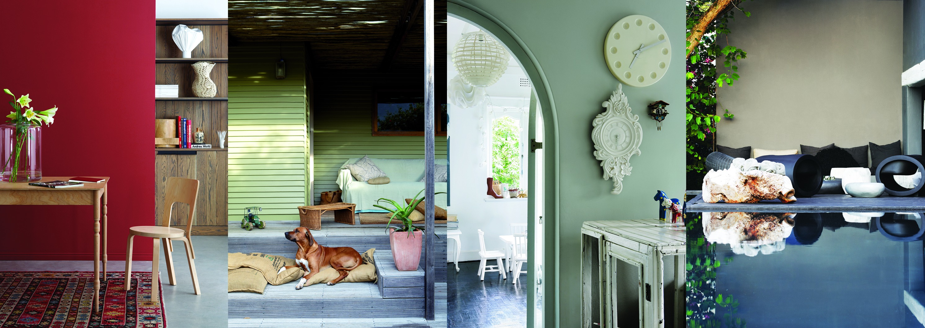
Element is as a theme that uncovers geological inspiration to explore our relationship with the landscape around us. A palette of soft neutrals, raw surfaces and tonal colours, Element is both luxurious and tactile. Its design expressions include mineral geometry, chalky colours and gradated finishes.

Discovery looks to the skies around us for inspiration, with colours that reflect our astronomical fascination. This palette features cool colours complemented by soothing neutrals and bright colour pops to recreate night-sky starscapes. The design expressions include weightless ombrés, powdery effects and interstellar bands and stripes.

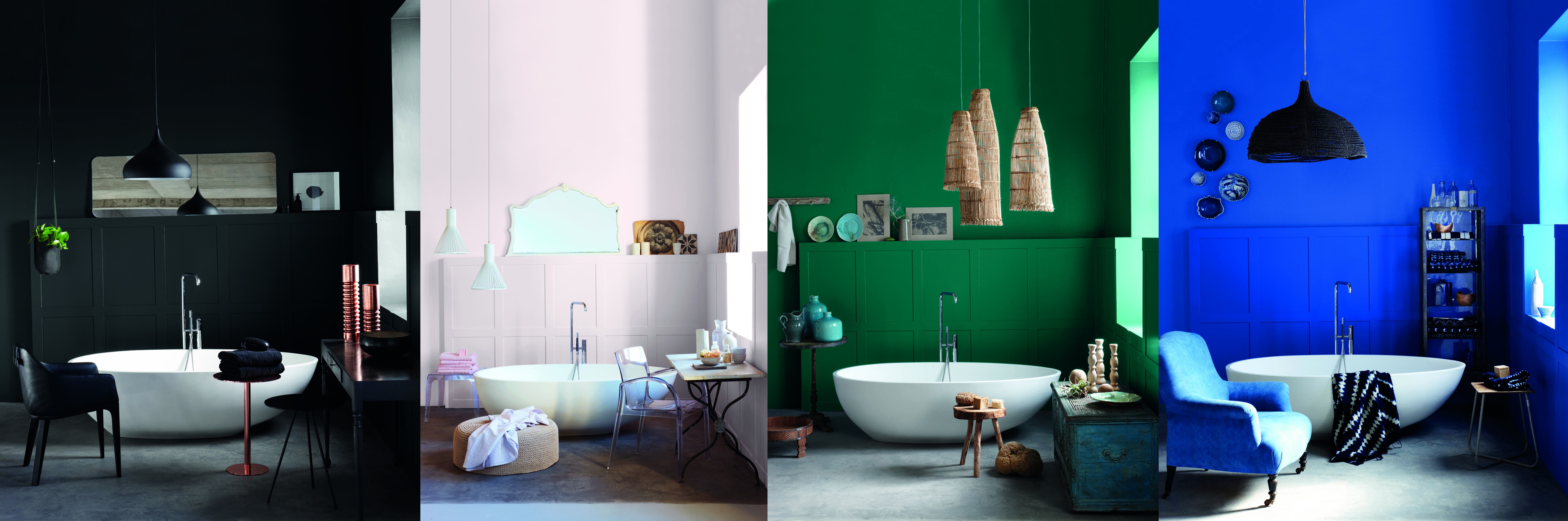
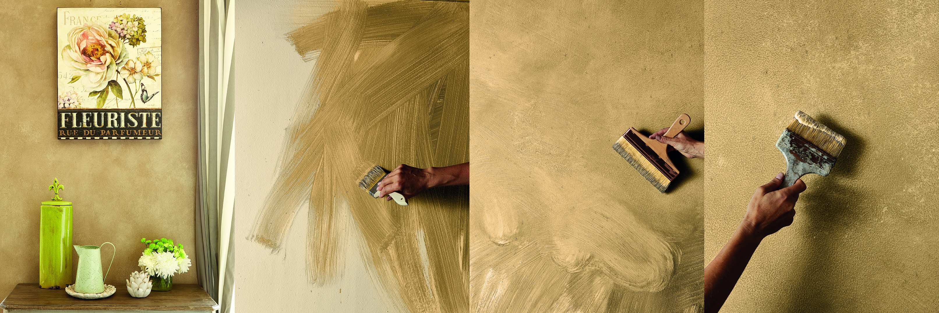
Heirloom looks to that past for indulgent luxury. Rich colour and texture inspires a new classicism in design, with a sensual palette of neutrals and moody tones. Design expressions here include colour treatments that mirror Old Master paintings, a careful balance of light and dark tones, and artful decay in textures.

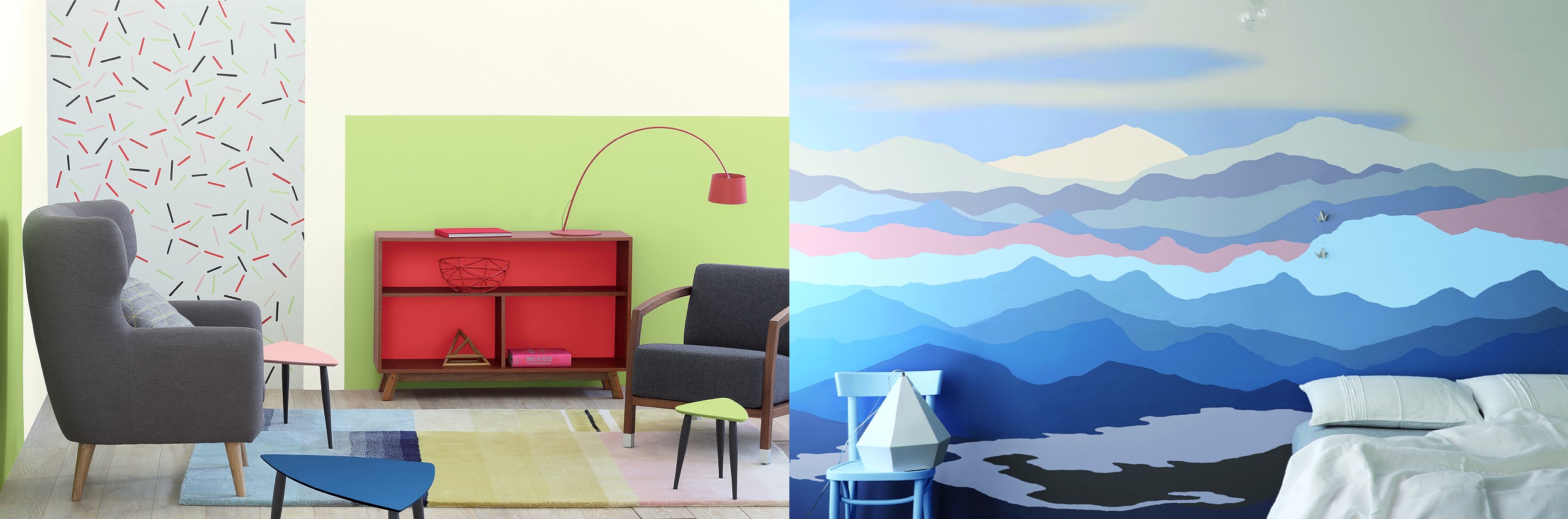
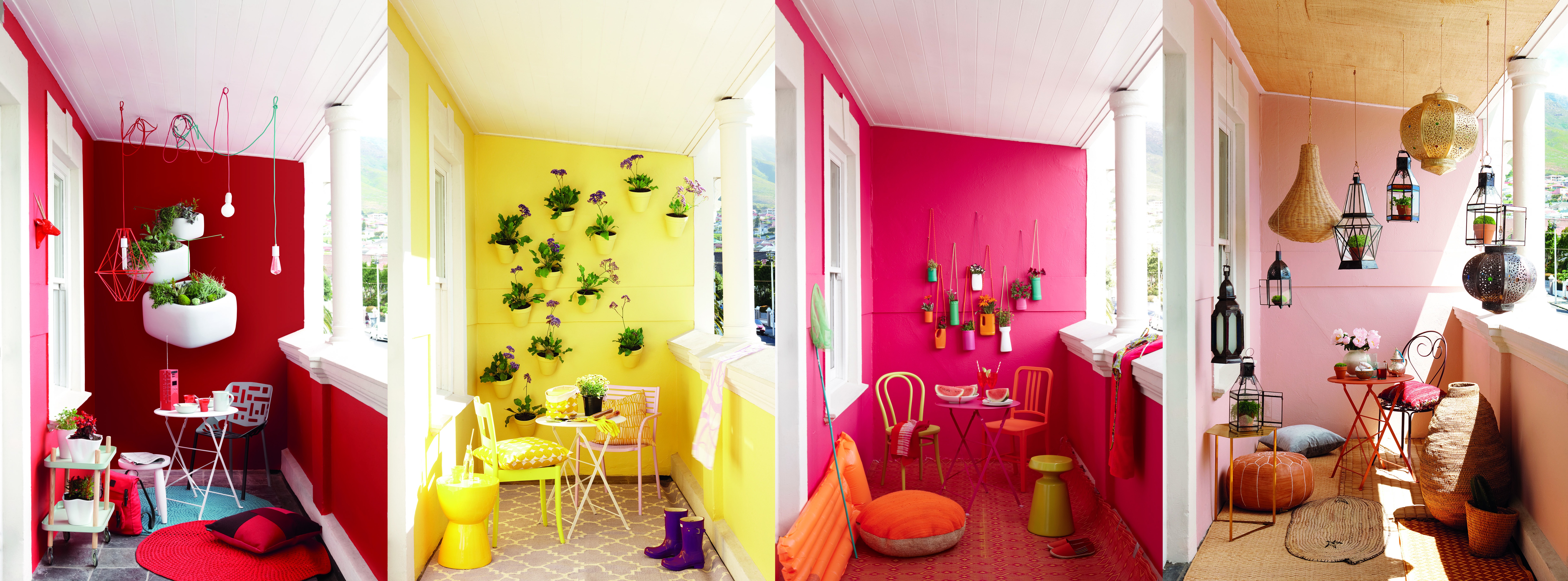
Connect is bold and bright, taking the energy of the Memphis design movement and channelling into unpretentious and exuberant interiors. A palette of upbeat colours is used here to create lively patterns and surface treatments. Design expressions include geometric motifs, sculptural colour treatment and all-over colour.

The 2016 Colour of the year:
Atlantic Beach B5-B1-1: Atlantic beach is an intense blue inspired by the coastal energy of Brazil. It is a stimulating, refreshing colour that promotes focus and commands respect.

Leave a Comment