

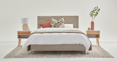
As a wonderful alternative to bold, colourful design, a restrained colour palette helps to create a refined and soothing atmosphere in the home. Here’s how to use neutrals to transform a space.
Use it as a springboard
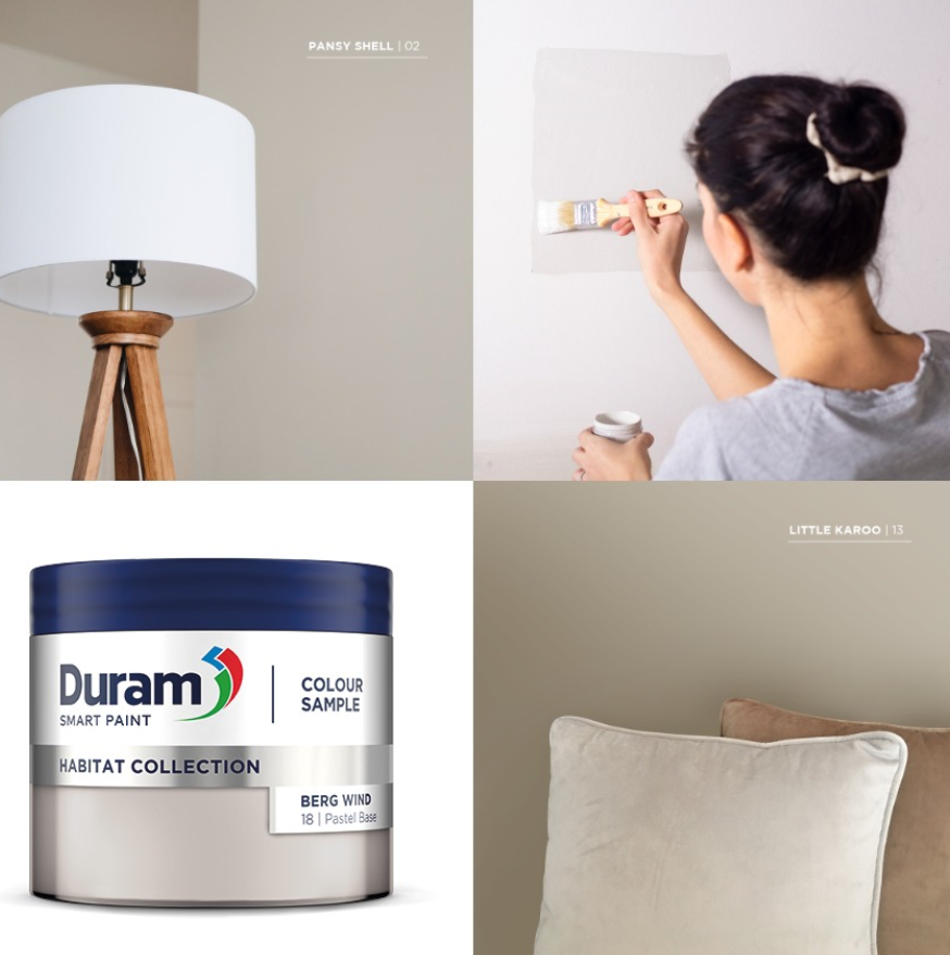
The global trend towards sustainability sees us incorporating earthy neutrals in the bedroom. Lauren Lambert, Duram Paint brand manager, says: “Duram’s Habitat Colour Collection is inspired by nature, and warmer organic tones like Pansy Shell and Little Karoo create a grounded and serene atmosphere for you to rest and unwind.” Lambert says that when used as a foundation, neutral colours provide a perfect base to add layers, tones, and textures to a bedroom. While softer neutral colours accomplish a sense of simple serenity, deeper shades can offer depth and definition. “Try our dark inky hues like Heron’s Crest and Bushveld Night to achieve a soothing and intimate feel.”
Add elegance
According to Nozipho Kunene, Plascon retail marketing manager, neutral hues are a dependable palette of soothing and timeless tones, perfect for easily adding an element of elegance within your space. “There is no better place to apply a range of subtle and age-defiant hues than within one’s bedroom.”
Kunene says: “Neutral shades and tones like Bare Necessities O3-D2-2 or Cream of Mushroom 32 are ideal and assist in creating a serene and tranquil atmosphere. We recommend Plascon’s Iconic Double Velvet Pure which has new air-purifying technology which removes harmful pollutants from the air to create a clean and healthy indoor environment.”
Timeless appeal
More than just decorative, colour is emotive. Lani Carstens, Rust-Oleum marketing manager, believes that it has the potential to enrich experiences and how we feel about our personal spaces. “As a sanctuary, bedrooms should encourage calm, provide a relaxing retreat and support restful sleep. Using neutrals goes a long way in the pursuit of this ideal. The great thing about neutrals is they never get old and if you do tire of them it’s easy to accentuate and change things up with a statement paint colour and introducing a mix of textures, finishes, and décor elements.”
Carstens says that shades of grey and soft chalky whites are all neutral favourites – and with their understated allure, they pair easily with soft muted pastels like pale pink, creating a calm interior to rejuvenate the mind after a busy day. “When used sparingly, the result is fresh but not too girly. The same can be said of pale muted blues and greens which bring nature in and are peaceful hues that pair perfectly with a grey palette.”
She adds: “The power of finish and the effect it has on the use of colour should also not be underestimated. From velvety soft, chalky matt vintage and distressed finishes to high-sheen dramatic lacquers and high-gloss walls and furniture – finish is expected to become as important as colour and neutrals in 2021.”
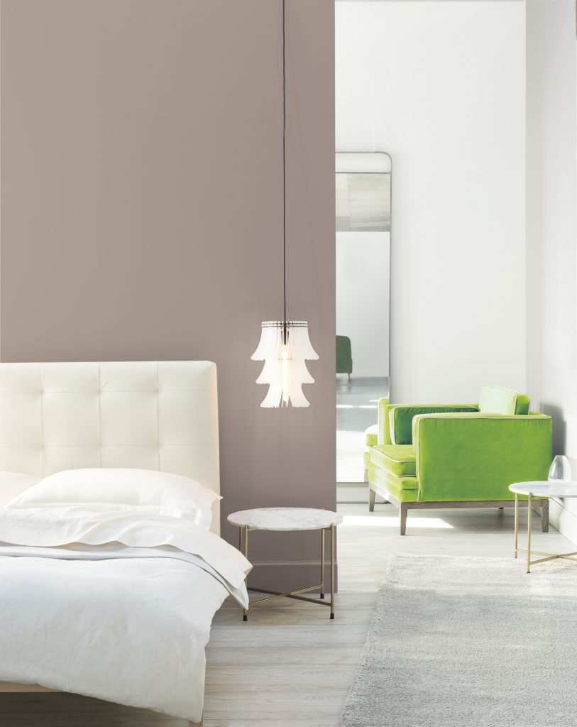
Adopt the 60-30-10 principle
Herman Rabe, Prominent Paints technical training manager, explains that the rationale for using muted, neutral colours in a bedroom is these shades are inherently more relaxing and encourage tranquillity and promote a sense of calm. “As a subsidiary of PPG, the world’s leading paint manufacturer, Prominent Paints has access to the latest colour research and according to the experts, finding the right combination of colours for a neutral bedroom is made easy when using the 60-30-10 principle. This simple rule will help you find the perfect balance of colour for your bedroom makeover. Approximately 60% of your room should be the main neutral colour on walls, approximately 30% of your room should be a feature wall colour in a slightly stronger neutral shade and approximately 10% should be an accent colour such as trim, or even an inspiring object like a cushion or sofa.”
Go for grey
Palesa Ramaisa, Dulux Colour expert, recommends warm greys, which are currently on-trend, as they are versatile and can play as the perfect backdrop for any space. “Soft warm greys also have the ability to make smaller spaces seem airier and more open while keeping them cosy and inviting. Warm greys are ideal because they tend to go very well with several colours from greens to blues and rich burnt oranges/tobacco shades.”


Leave a Comment