

Lift your home’s spirits with an injection of green! We show you how…
Why green? The colour of nature, harmony, rest and rejuvenation, green is suited to almost any room in the house, whether you’re after dark and dramatic or light and zesty. And there are so many variations of green out there too – from lime, pistachio, forest and emerald, to sage, kiwi, mint, asparagus, apple green, sea green, grass green… you get the picture.
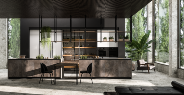
Green in the kitchen
Whether you’re pairing a green island with creamy, white cabinetry; bringing it in via glossy subway tiles or simply painting apple green on the walls to offset your collection of stainless-steel appliances, green works in a kitchen every time. Got an all-white kitchen? Add green to your window treatments; introduce green kitchen gadgets, cookware and a windowsill lined with fresh green herbs in planters. Also think green for your splashback, the stools around your breakfast nook and throw in a large ‘statement green’ appliance in the form of a fridge or oven. If you need some contrast, orange-red accents will do the trick, as pairing green with a red-based hue creates a complementary scheme.

Image: Vogue
Green in the bathroom
Green looks especially inviting in a bathroom and you can bring it in easily – from floor-to-ceiling tiles to wall paint, towels, plants and other accessories. Greens work perfectly in all-white bathrooms, contrasted by a crisp white bath, or where there is a wooden vanity for an added layer of warmth. On the floor, you can mix browns with muddy greens for an earthy feel to complement a bathroom space where the aim is to evoke feelings of tranquility and relaxation. If your bathroom has a large window, using green inside will serve to connect the space to the green of the outdoors.

Image: Domino
Green in the bedroom
Darker and brighter greens are best left out of the bedroom if your aim is to have a good night’s rest. Rather aim for lighter tones of green that exude calm and serenity. It’s the muted tones that have the most soothing effect. You can always bring in ‘livelier’ accents of green for decorative impact in the form of cushions, throws, frames on the wall, bedside lamps and rugs. If you’re concerned about the monotony of green on green, just add blue. Not only does it pair well with green, it also promotes calmness and tranquility. The trick is to use the right shade of blue as there are both ‘warm’ and ‘cool’ blues. Warm blues contain hints of red or purple and seem to come towards you, so they cosy up a space.

Image: Ikea
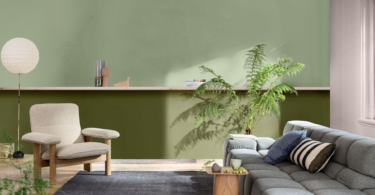
Green where you live, work and dine
In the living room, you can either go big with green or apply it in small doses that still make an impact – using art, wallpaper, furnishings, rugs, cushions, ottomans, vases and the like. Paint an accent wall or an existing piece of furniture a bold and lively green to bring it from tired to instantly refreshed. Green can also encourage relaxation in a family room, especially when used as the main colour within a ‘landscape’ of neutrals like wooden furniture and accessories in natural materials. The botanical trend is still very popular, so inject green into floral-inspired upholstery fabrics in your living areas, along with warm metallic accents such as gold, copper and brass.
Continue the botanical theme into the dining room with mellow citrus hues on the walls and/or lime-inspired pops of green on chairs, table linen and dinnerware. And make it a habit to stand a vase of fresh blooms on the dining-room table.
In a home office or study, green can be both calming and energizing as it promotes concentration. If you want to use it to awaken the senses while you work, think bolder shades such as emerald, pine and forest green for the walls.

Image: Wayfair UK
Did you know? Colour company, Pantone, revealed a zesty shade of green as its colour of the year for 2017. The colour, named Greenery (or Pantone 15-0343), is described by Pantone as a “tangy yellow-green” often seen in foliage. In an interview with the New York Times, executive director of the Pantone Color Institute, Leatrice Eiseman, said the choice was made in response to a “stressful and tense world” and that “illustrative of flourishing foliage, the fertile attributes of Greenery signals one to take a deep breath, oxygenate and reinvigorate.”


Leave a Comment