
Spring is in the air and just the time for some updates around the home.
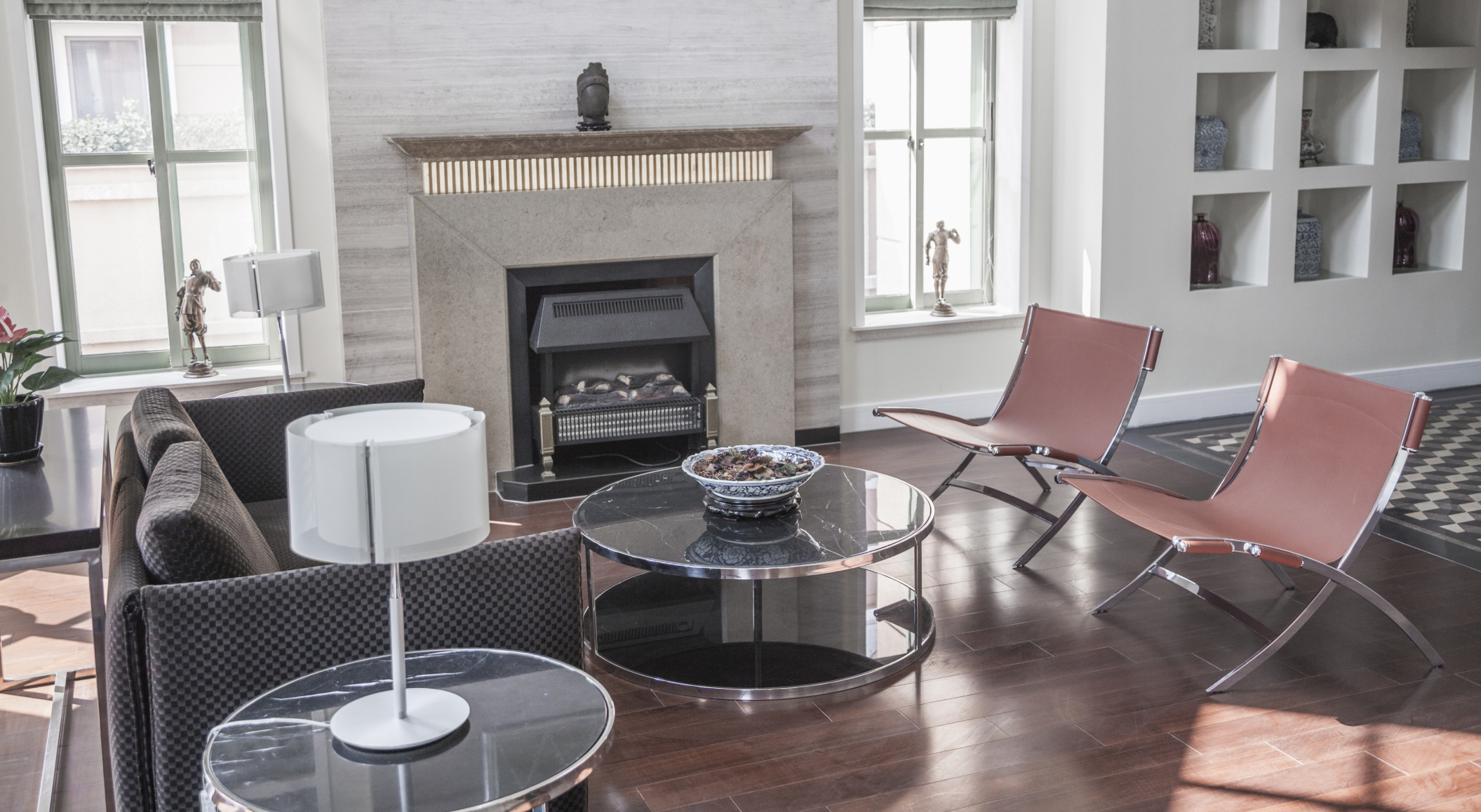
Leaving your bigger furniture pieces as they are while updating some of the accessories and accent pieces is one of the quickest and cheapest ways to completely change the look of your room.
Know where to invest
It is important to always buy the best quality furniture that you can afford. You’ll be sitting on your couch daily for years so you should make sure it’s a comfortable one. While you won’t be able to change all of your furniture every year, changing your scatter cushions, curtains and throws doesn’t have to cost you an arm and a leg.
Colours for spring
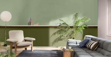
Design bloggers based in the northern hemisphere are planning their colour stories for autumn. Things are looking moody with black and grey, subdued blue and green, mixed metals, and light wood tones.
How do we translate those vision boards for our spring and summer seasons?
A good starting point would be to nix the black pieces and instead mix in fresh white pieces. Keep the grey as a neutral starting point and then add bright, bold pops of blue and green. Metals and wood are essential to livening up any room’s decor.
Patterns and florals versus keeping things simple
“Florals? For spring? Groundbreaking,” says powerful women’s magazine editor Miranda Priestly in the popular film The Devil Wears Prada.
And she has a point. Around this time of year it suddenly seems as if everything has scores of flowery patterns plastered everywhere. In contrast, stark minimalism has in recent years been flooding interior decor around the world. In these designs just the basics remain with everything extra and optional ruthlessly given away or thrown out.
Perhaps a compromise between the two would be the best option. Designer Coco Chanel said, “Before you leave the house, look in the mirror and remove one accessory,” and this could be translated to your home’s decor by discarding the unnecessary.
Choosing colours
When it comes to picking complementary colours to use in your design, look no further than the good old colour wheel. It teaches that colours work best either with those on either side or the colour directly opposite. So, if you are in love with Pantone’s Colour of the Year Radiant Orchid – a bright pinky purple – then try pairing it with reds and deeper purples or vibrant green.


Leave a Comment