


Plascon’s annual Colour Forecast has been keeping South Africans abreast of global colour trends since 1999. It presents a snapshot of what is happening in the worlds of design and interior decoration and interprets the most relevant and contemporary colours into easy-to-use, inspiring palettes for the local market.
The 2014 Plascon Colour Forecast is no exception, and was spearheaded by Plascon’s Colour Manager, Anne Roselt. After serving for 10 years on the panel of the London-based International Colour Authority (ICA), Roselt has since been invited to join the panel of trend forecasting group, the Mix, making her South Africa’s foremost colour authority. The Mix Trends reports are published by the Global Colour Authority.
Roselt brings a wealth of knowledge and longstanding expertise to bear on the choice of colours for Plascon’s forecast.
“Plascon’s Colour Forecasts are a blend of the latest trends both locally and internationally. Each colour plays a vital role in translating the trends that we see in a multitude of industries,” says Roselt.
For the 2014 forecast, Roselt worked in conjunction with leading design and trend thinkers, who identified key lifestyle, design and interior trends and then crystallised these into four key themes. These all fall under the overall theme for 2014 of Colour Nation – referring to the ways in which colour defines our identities, our world, and our experience of it.
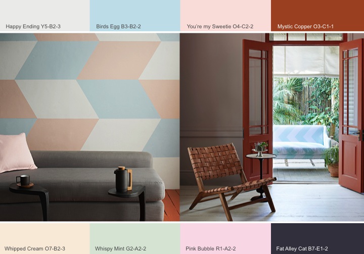
The 2014 Forecast Themes:
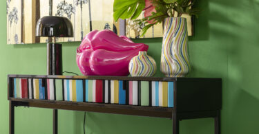
Urban Tribe is a response to the growing trend towards national pride – especially amongst BRICS nations. With countries like South Africa and Brazil coming to the fore as global centres of design, their unique aesthetics are being showcased around the world. Urban Tribe expresses this with a warm and grounded palette of contemporary brights, plus gold and black accents.
Second Nature takes a new look at our relationship with the natural world. As more and more people live in cities, the urban becomes our key reference point, and combining this with the natural world becomes vital to keep our lives balanced. This sentiment is captured in a bright, vibrant palette of greens and blues, activated by a bright yellow accent.
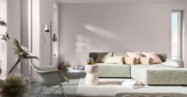
Calm Contrast tracks the evolution of pastels in modern design, showing how they’ve moved from on from being purely “feminine” colours. This palette shows the combination of classic pastels with grounding neutrals, plus dark blue and copper, creating a balanced, contemporary feeling.
Inner Space is inspired by the ways in which we use sanctuary environments to rest and reflect in a busy world. Drawing additional colour inspiration from the stars and skies above us to enhance the contemplative mood, the theme is expressed through a collection of neutrals and blues for a deep, tonal palette.
VISIT:

Leave a Comment