
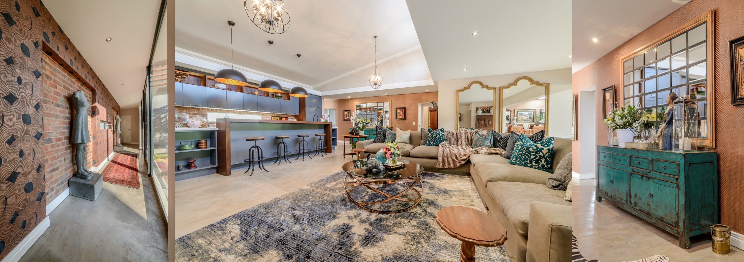
One of the most effective ways to portray your personality through interior design is with the use of colour. Each hue has a specific meaning and enhances one’s mood.
In 2021 we’ll see a return to bright colours, with an emphasis on vivid palettes in furniture, lamps and accessories. We’ll also welcome a re-emergence of pastels with increased nostalgia for ’80s-inspired designs and colours. Carin van Heerden, owner of Carné Interiors, breaks down her top colour trends for 2021.
Gorgeous green
Because of its strong associations with nature and ability to calm the mind, green is often used in interior design. The colour symbolises growth, freshness and fertility, and also helps to enhance levels of concentration.
From gentle olive to deep emerald, there is a huge variety of green hues. Your entire room can be decorated with this versatile colour – from curtains, scatter cushions and tablecloths to wallpaper, sofas and objets d’art – and there will still be enough scope to create an atmosphere of comfort and cosiness without feeling overwhelmed by a single colour.
Cool grey
Grey has been popular for several years, and justifiably so, as it can be paired with pretty much any colour you can think of. Light grey, being a combination of black and white, retains the qualities of both these colours: the ability to create the illusion of depth and space. Used on its own, grey interiors can be cold, so I advise clients to pair it with contrasting colours and textured elements to create warm and inviting spaces.
Illuminating yellow
Along with grey, Pantone has selected yellow as one of its two choices as Colour(s) of the Year. They call it Illuminating yellow as represents the bright, light shade of yellow that can perfectly combine with grey.
We find that yellow is a wonderful, and bold, accent colour, when contrasted in décor with darker colours. For example, in a bedroom with dark blue linen, opt for yellow cushions or curtains. It’s a practical colour that easily works throughout the home, bringing warmth and a soothing ambience.
Bloomsbury orange
A trend that’s making a return is the bold patterns of the early 1920s, known as Bloomsbury designs. Along with these geometric and mixed styles, orange often stood out. Rare Bloomsbury interiors designed by artists such as Vanessa Bell, Roger Fry and Duncan Grant are being reassembled from public and private collections across the world, and have been brought together to celebrate Bloomsbury’s wider contribution to Britain’s early 20th-century avant-garde style. Orange is often found in these styles next to yellow, green and royal blue.
Pastels
In 2021, we see a lot of pastel pink and pastel blue re-emerging from previous seasons, and being used in many décor accessories such as cushions, accent pillows, lamp stands and curtains, among others.
In fact, for the northern hemisphere’s upcoming summer season – and our summer season in December – pastel pink and serenity blue are two top colour choices for patio and living room interior designs. Pastel pink in wallpaper designs is particularly trendy right now.
Visit www.carneinteriors.co.za


Leave a Comment