

Colour adds emotion – there is a shade for every feeling one might want to express. It’s often what makes a good room great and the finishing touch in a space that makes it your own. Commercial and residential interior designer Dhershan Naidoo, from Dhershan Interior Designs, shares how adding colour to your home requires a well-constructed palette, the ability to convey the desired mood and most importantly to read the light in a room.
Harmony
For colour to work as a design convention in any space, there needs to be harmony first.
Look at the bare bones of your space – your floors, walls and ceilings – and grade your selected neutral colour from its darkest to lightest shade. Think of the floor as grounding the space and therefore holding the darkest shade.
Dark floors are practical for high-traffic areas in the home. Meanwhile, light ceilings appear to the eye as high ceilings. Ombre walls are another trick to add height. Ensure windows and doors line up and nothing jarring obscures your clean canvas.
Connotation
Every colour, even a neutral, is a colour. Keep this in mind when selecting your neutral. Popular neutrals such as white, beige, taupe and grey can have different undertones, so it’s best to think about your neutrals in terms of cool and warm colours.
If you want a light, bright and cheerful room, ask for a cool tone; and if you want a warm and cosy space, ask for warmer, more matt finishes. Carry samples of your paints and flooring with you to ensure you get input from the people who work with the materials daily.
Layer
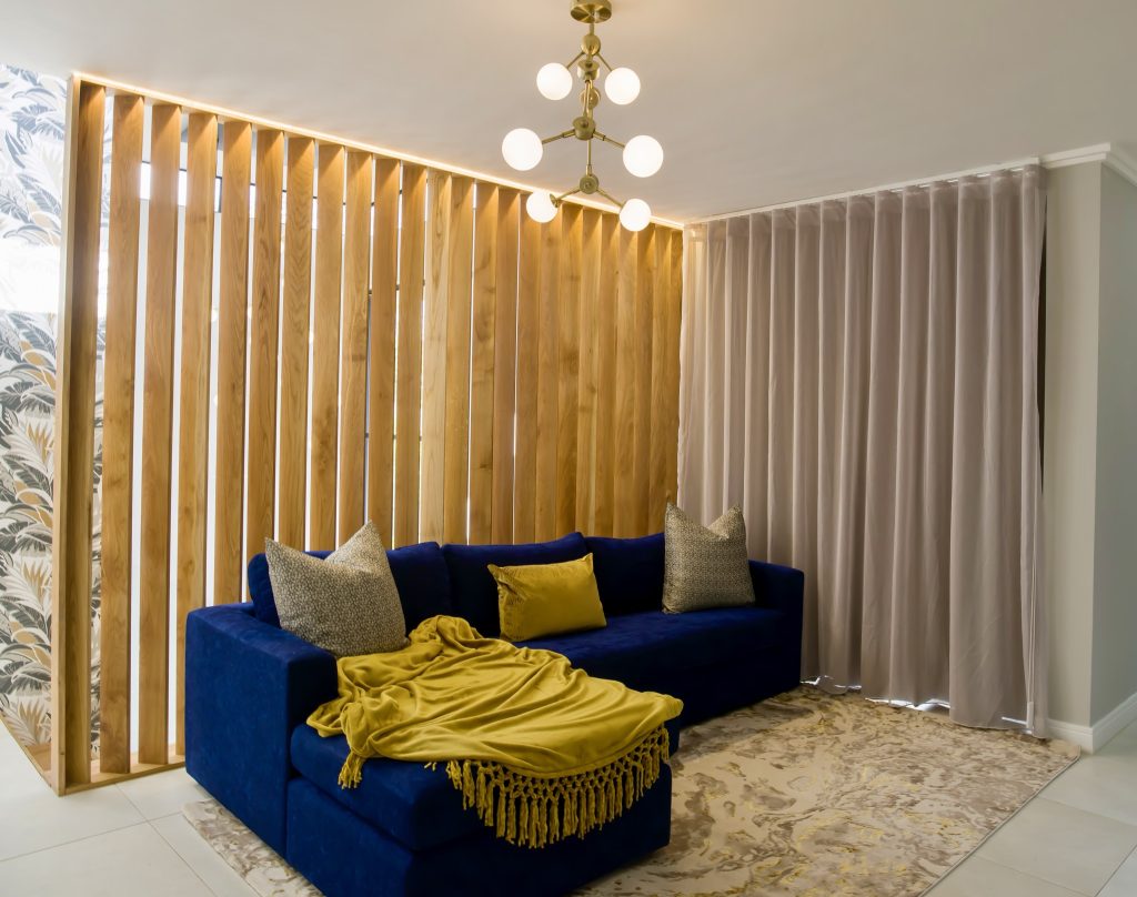
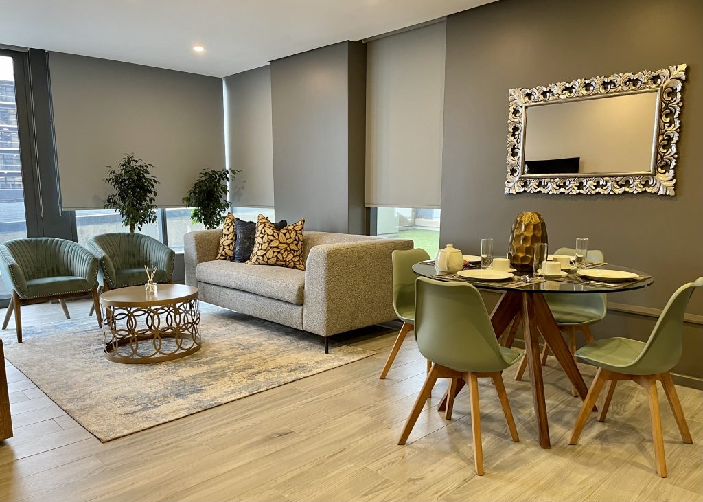
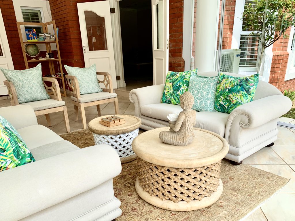
Once you have a base, you can begin to layer the space with furniture and functional objects. These can be monochromatic, have texture, or be metallic. A quick trick is to squint at your room and watch the colours blur through your barely open lashes. If something stands out and you don’t want it to, remove it.
Go with your personal taste
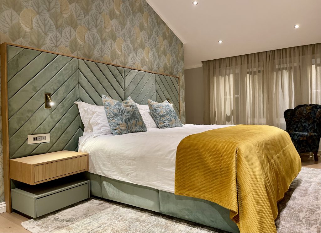
Choosing that special colour is a very personal thing. There are no rules; you should choose a colour that speaks to the mood you want to convey. However, depending on where and how you use colour, you can have various outcomes. A dark colour or even dark wallpaper on the furthest wall can close the space. A very light colour without any depth on a wall that has full sun in the morning can be garish and may show off any imperfections in the plaster. Avoid drastic colours in the bedroom, as you want this to be a calm and relaxing space.
Uplifting colours
The trendiest colours in 2022 are hopeful and uplifting. Think of the fresh, clean greens in a herb garden, cotton candy pink reminiscent of rose quartz and sunsets, invigorating teals, happy blues, sunflower yellows and crisp greys.
Let the light guide you
When you are ready to add that pop of colour, let light guide the scale at which you apply it. Soft furnishings such as scatters should vary in textures, while large sofas, feature walls and floors should be more considered.
Start with an object you love
If you want to live in colour and can’t find the right colour scheme, take inspiration from good décor items that you fall in love with. This could be a beautiful rug, painting or appliance. Draw on the colours used in this object to guide you in your colour choices.
Visit www.dhershan.co.za
Email dhershan@dhershan.co.za


Leave a Comment