
Craving a new look for your kitchen? We share great colour tips that will instantly transform the space.
Be cautious with colour
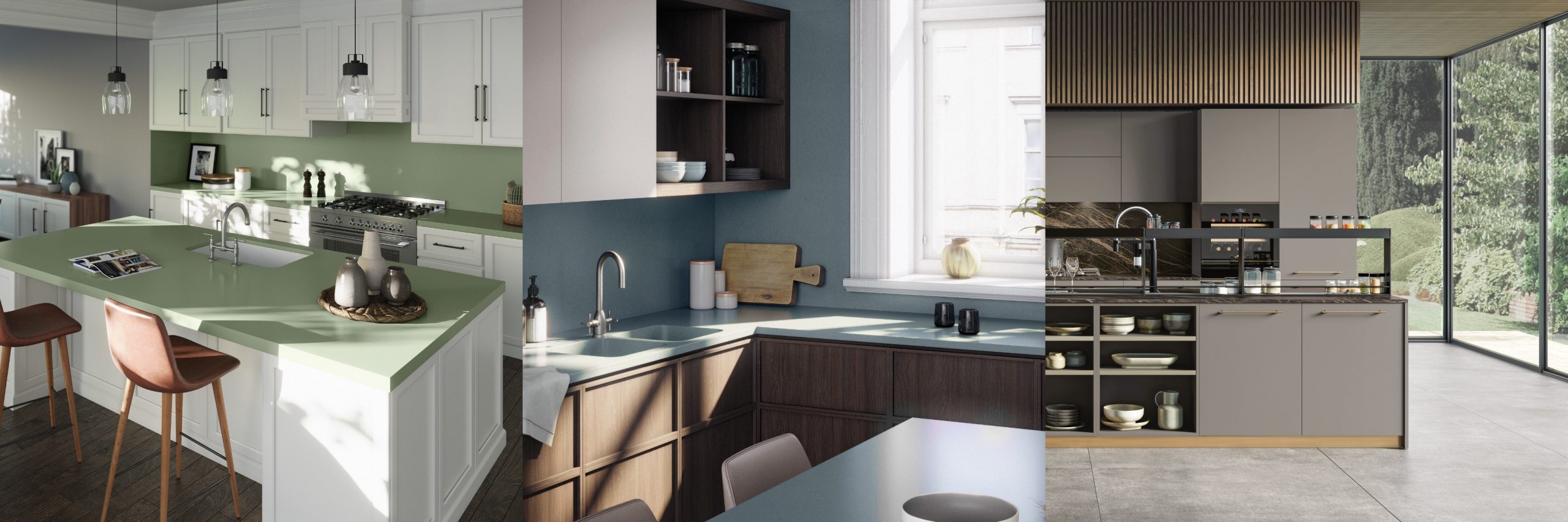
“Using colours in your kitchen is exciting, but caution must be exercised to keep it classy. We love adding strong colours inspired by nature mostly in accessories. Take a look at the bronze detail kickplates and handles and lighting bringing warmth and interest into the kitchen, whether light or dark cabinetry.” – Melanie Stein, owner of Eurocasa
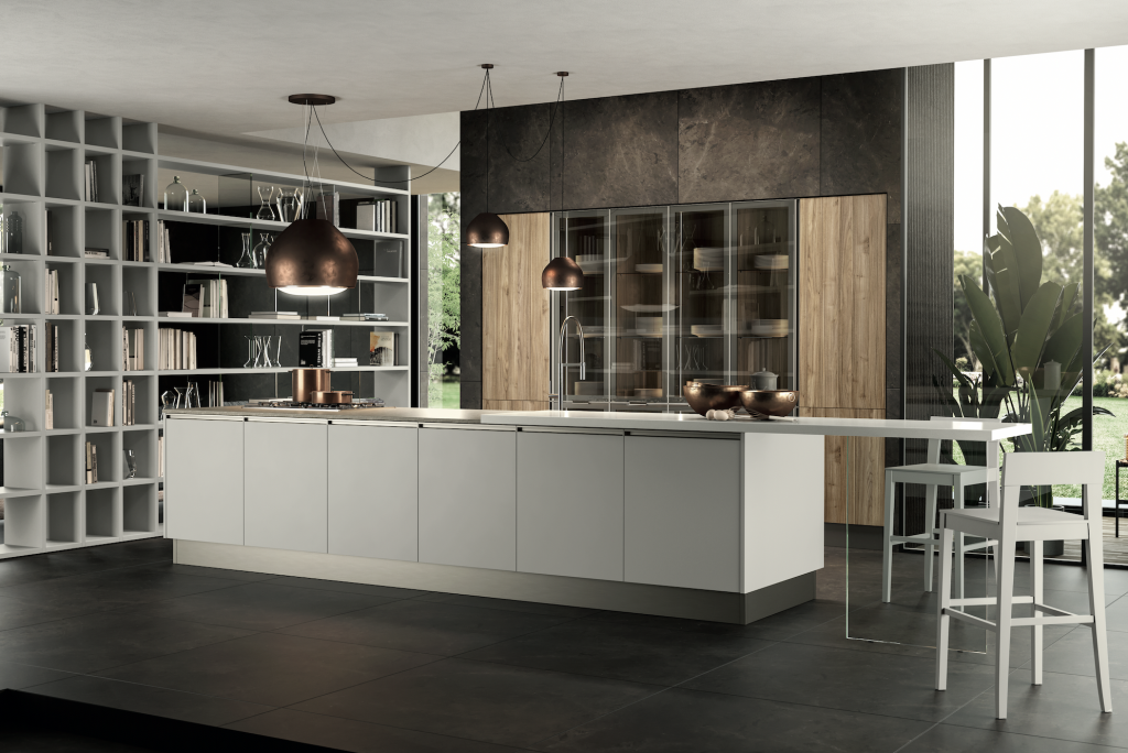
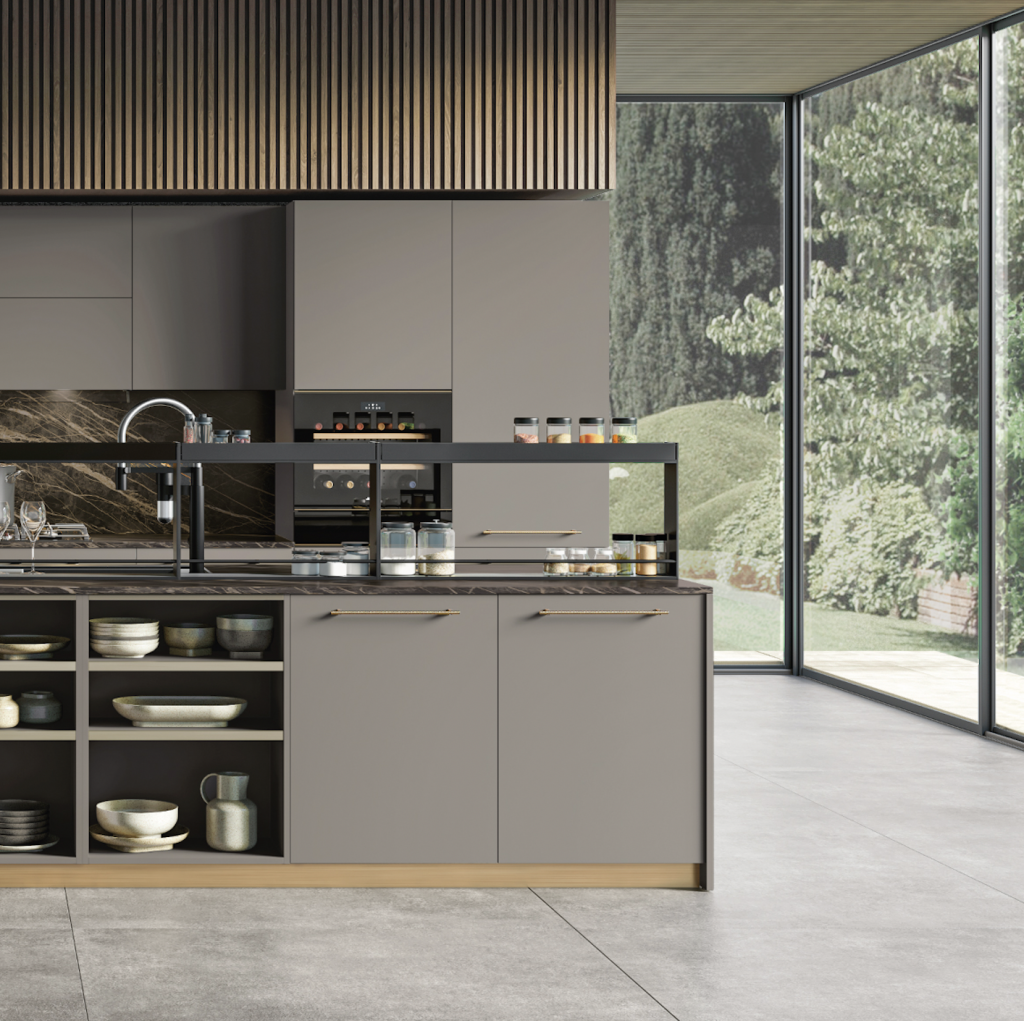
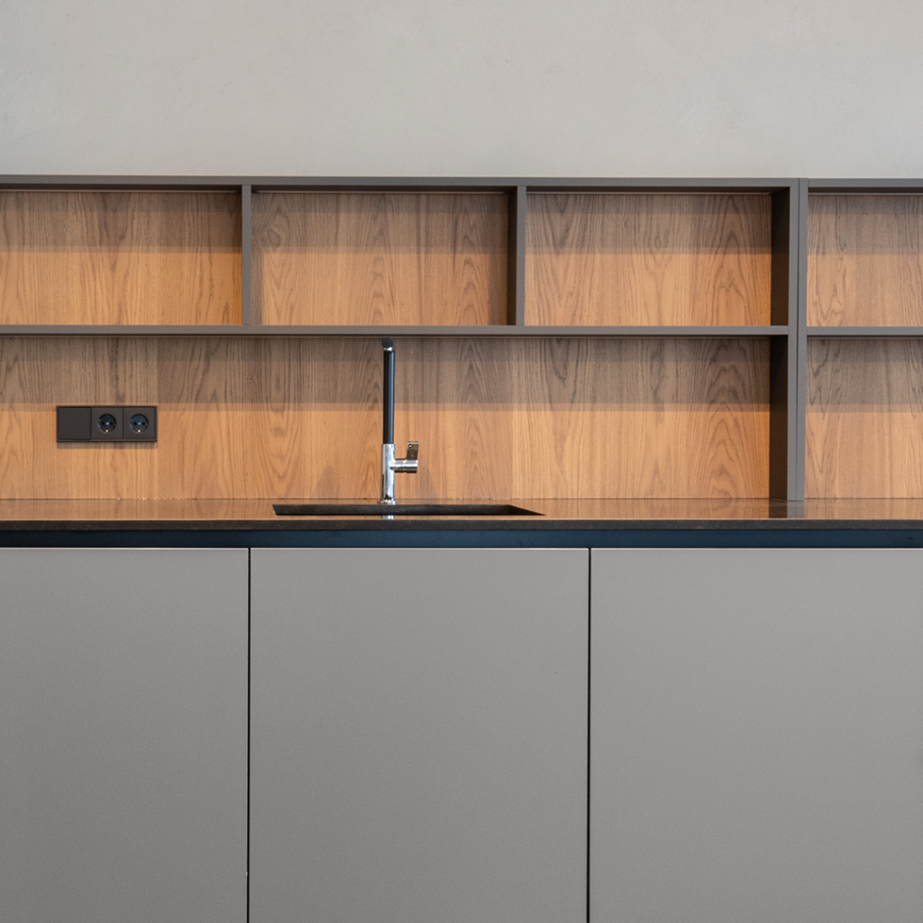
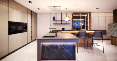
Combine stone and wood
“We love using dramatic stone and wood to add a colour effect in the kitchen. Dark grey and warm wood colours are a match made in heaven. The textures of the stone also add contrast to the fine detail enjoyed from the cabinetry, and the warmth of wood lifts the spirit of the room beautifully.” – Melanie Stein, owner of Eurocasa
Go for a classic colour combo
“The classic black and white colour combination always work so perfectly, as seen in this sink and mixer combination featuring Tamryn Seopela’s kitchen design style. She pairs the Franke Ronda ROG 610-41 and Maris MRG621 in Polar White with the Active Plus sink mixer in Black, creating a striking contrast. Hints of gold, wood and greenery add a magical pop of colour to elevate the look.” – Rakhee Hurdial, marketing co-ordinator at Franke South Africa
A grey kitchen is timeless
“A grey wall colour can lend a sophisticated air to your kitchen. Curious about how to pull off the look? Try Ridge from our ColorPro stir-in paint colour, available in three consistent shades.” – Anel van Niekerk, brand manager at Duram Smart Paint
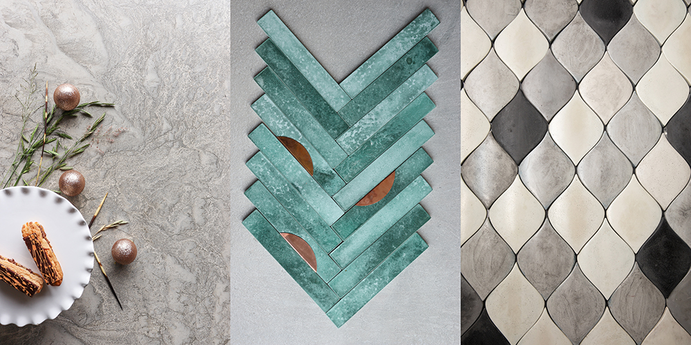
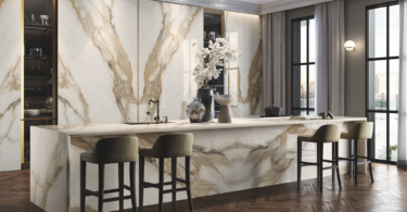
Transformative tiles
“We recently launched our Silestone Sunlit Days Range, which goes back to the roots of the Spanish Mediterranean. Subtle hues bring back the popularity of being bold and daring, with the toned-down colours of Cala Blue and Posidonia Green. Each tells a story of where their inspiration comes from, what impact it has on its surrounds, and ultimately the story of saving the ocean.
“Partnering with an international NGO, the beautiful tale of the Spanish sea and marine life combines with fantastic colours that can be used with countless complementary finishes like wood, concrete, metals, glass and many more.” – Linda Classen, marketing manager at Cosentino South Africa
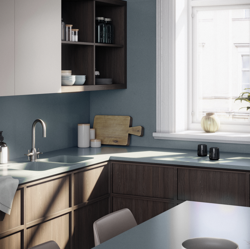
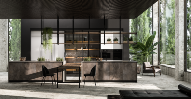
Go for green
“Over the past year, the home has become, more than ever, a place of safety and serenity. Colours and tones taht are reminiscent of the natural world are a sure way to instantly transform your kitchen while inviting comfort and calm.
“Our greens are an obvious choice. Together with the variegated aesthetic of Wolkberg’s Limesite tiles, the colour emphasises biophilic design; a standout trend that encourages incorporating elements of nature into our spaces.
“Our colour range features a collection of greens from a vibrant Emerald for a luxurious look-and-feel and Woodlands for a forest-inspired atmosphere to the softer Kiepersol for a fresh aesthetic.” – Olebogeng Mathibe, industrial designer at Wolkberg Casting Studio


Leave a Comment