Colour blocking has been around for decades – some say it was kick-started in the roaring 70s – and as with all trends, it has seen a cyclical revival. 2012 is one of those cycles, and we are seeing colour blocking extending from fashion to furniture.
Basically, colour blocking is when you pair two or more contrasting colours together to create a wow effect in spaces in your home. This can be done from furniture to ceilings, walls to accessories – and your imagination is the limit!
Traditional thinking binds bold colours to colour blocking, however with the prominence of pastels this season, we are seeing very successful and beautiful pastel pairings. The trick is to keep like with like, so if you are using pastels, stick to pastel pairings, and vice versa for bolds. You should also stick to no more than three colours in your pairings, to give maximum impact to each colour you are using in the item or space you are splashing out on.
Colour blocking is a great way to spruce up your walls. An accent wall, for example, is a form of colour blocking: painting one wall a bright, bold colour in contrast to the main neutral tone, really lifts the room. This type of colour blocking can also be used to highlight decorative elements against the wall, such as mirrors or artwork.
You can also introduce colour blocking through accessories, such as pillows, artwork, lampshades, rugs and throws, against more earthy furnishings. This is great if your tastes change with the seasons, as you just replace your deeper winter reds and oranges with spring pastels.
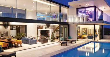
Open-plan is still a design trend in homes, with rooms and spaces flowing into one another. The difficulty with this is that defined spaces need to be created in ways other than through walls. Colour blocking is very practical in this instance, as different colours or different shades of colours, different textures, and even floor designs (decorative concrete versus carpeting versus tiles), create this definition.
Colour blocking need not just be solid colours. Prints and shapes can also be thrown into the mix, but should be used sparingly and in conjunction with solid colours to make them pop and not overwhelm the eye with too much detail. Shapes used in colour blocking can evoke “feelings”, for example, curvy lines and circles tend to encourage a light and fun feeling, so are great in younger kids’ rooms; whereas squares, rectangles and sharp edges work better in a more serious space like the study.
The exteriors of homes are also seeing gentle forays into the colour blocking trend, although the uptake in South Africa is small at this stage.
As the “rainbow nation”, our South African culture in itself is a form of colour blocking. We are daring, bold and creative, and translate our passion for life into our homes. As we inject our own flavours into colour blocking and see global uptake of our creative output, I am proud to say: one small step for colour blocking, one giant leap for South Africa’s global design footprint!
To get you started, here is the Colour Wheel which forms the basis of colour blocking, and how to use it:
- Analogue colours: three colours lined up next to each other, for example blue, blue-violet and violet.
- Complementary colours: colours that are directly opposite each other on the wheel, for example green and red.
- 90-degree angle colours: for example blue and green.
- T-colours: colours that form a T-shape, for example blue-green, red and violet.
Pink trick: replace red with pink and use the same combinations.
[signature:kerry]


Leave a Comment