
The colour of a room can affect your mood and even your thoughts. We explore the colours of the rainbow and suggest ways to use them in your home…
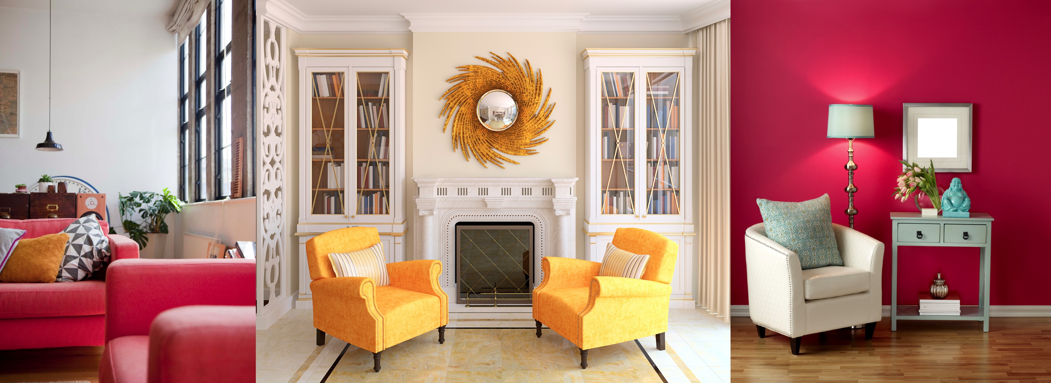
Red – The colour of abundance and passion, red stirs up the flow of energy in a space. It’s a good choice for dining rooms and kitchens as it increases appetite and stimulates conversation. It can create a strong first impression in an entrance hall. Use red as an accent colour above a fireplace or through vibrant accessories. Splashes of bright red will also liven up a playroom.
Orange – The colour of creativity and enthusiasm, orange produces an invigorating atmosphere that stimulates the senses. Too much orange can quickly become overwhelming, so it’s probably not the best idea for a living room or bedroom. Use it in your home gym for an energy boost.
Yellow – Yellow works well in kitchens and dining rooms as it’s a happy and uplifting colour. It also offers an optimistic lift when paired with more subdued elements such as stone, brass and wood. A splash of bright yellow can create the illusion of more space – paint it on a ceiling and watch the room expand. One of the best qualities of yellow is that it blends beautifully with almost every other colour, so pick different shades to use as cheery accents and accessories throughout the home – from warm golden tones, right through to crisp citrus hues.
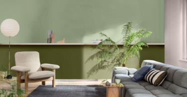
Green – The colour of nature, harmony, rest and rejuvenation, green is suited to almost any room in the house, but works especially well in muted tones in bedrooms because of its soothing effect (it is even believed to help with fertility). In a home office it can be both calming and energising as it promotes concentration. It also encourages relaxation in a family room – especially when used as the main colour within a ‘landscape’ of neutrals like wooden furniture and accessories in natural materials. If you want to use green to awaken the senses, think bolder shades such as emerald, pine and forest green.
Blue – Good for promoting calmness, contemplation, stability and tranquillity, blue is considered a serene colour. It is often recommended for bathrooms and bedrooms. The trick is to use the right shade of blue as there are both ‘warm’ and ‘cool’ blues. Warm blues contain hints of red or purple and seem to come towards you, so they cosy up a space. Use them around the social areas of your home. Cool blues, on the other hand, have a hint of yellow in them, and give the effect of pulling away. Some of them are almost too chilly, but work in more sterile environments, like bathrooms.
Purple – Purple combines the stability of blue and the energy of red. At its darkest, purple invokes feelings of sophistication, extravagance, luxury and drama. At its lightest, it can be relaxing, romantic and nostalgic. It’s a favourite of teenage girls, as it falls somewhere between ‘little girl’ and ‘grown up’. Use it in bedrooms, living rooms and even kitchens – purple provides the perfect backdrop for the white and silver of modern appliances. Pair two contrasting purples together for a bit of fun, or use it as a wonderful accent colour – either way, it’s bound to make a statement.
Next month we look at ‘neutrals’ (black, grey, white, and brown) and how to mix and match them with the colours just mentioned…


Leave a Comment