
Text Annette Klinger
From pastels and beiges to greys, greens and brights, Plascon’s Essential Collection boasts an assortment of colours that are tried and tested favourites.
We have all been there: we want to spruce up our lounge or give our kitchen a new lease on life but have absolutely no idea where to start. Enter Plascon’s Essential Collection. Compiled by Plascon expert Anne Roselt, the collection of 108 classic colours is based on paint professionals’ all-time favourite shades. “This collection makes selecting colours easy for anyone, from the designer and the architect to the person who’s never painted their home before”, says Plascon colour manager, Anne Roselt. To help you choose your favourite shade, the collection is divided into nine themes, each with its own distinct mood – making the process of transforming your home into your dream space all the easier.
Sleek
Each of the greys in this collection has unique undertones that range from warm to cool. A lot of the shades can also be used in combination to create a feeling of classic elegance or a warm contemporary look.

Wall painted in Plascon Wall & All River Clay (EC69)
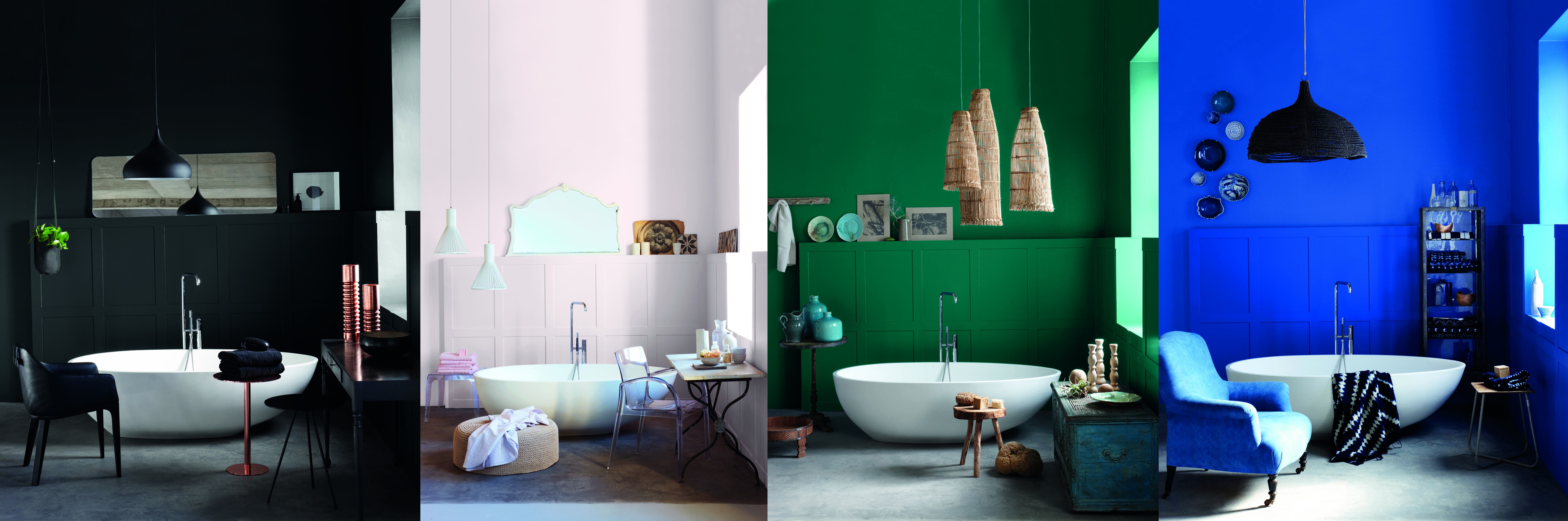
Moody
Using the dramatic shades in this collection creates a sense of mystery in your home. With a few understated accessories, they produce a glamorous result without breaking the bank.

Wall painted in Plascon Cashmere Tribecca Corner (EC48)
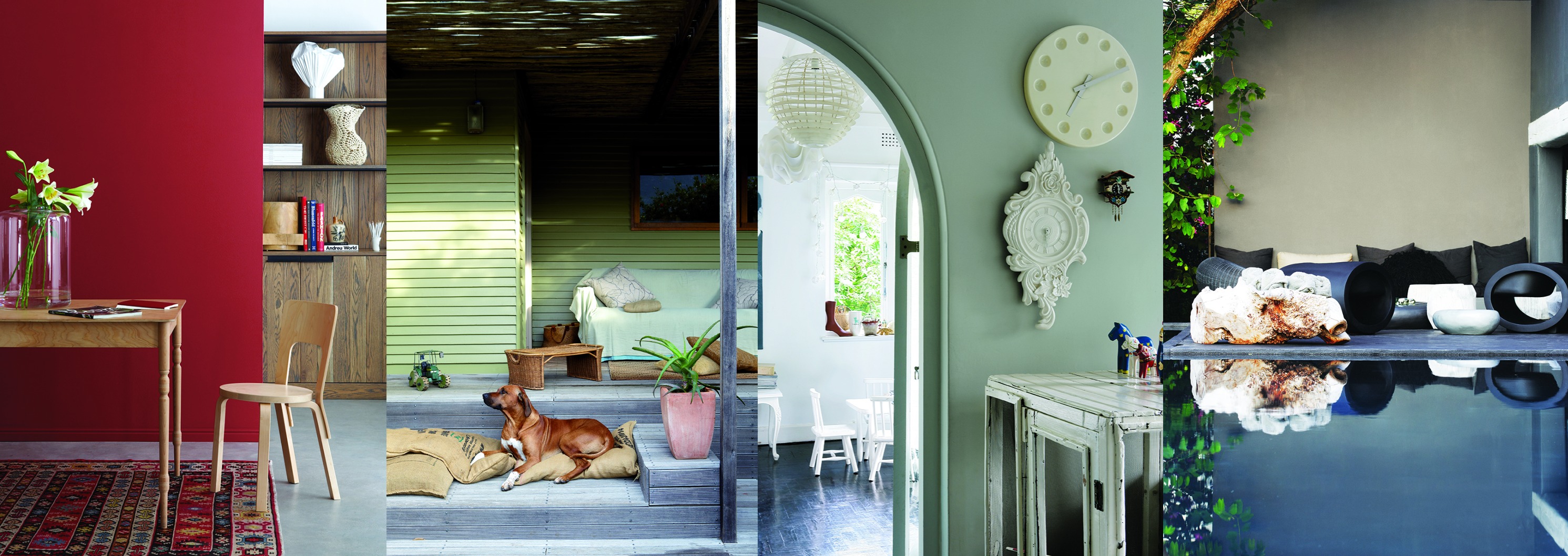
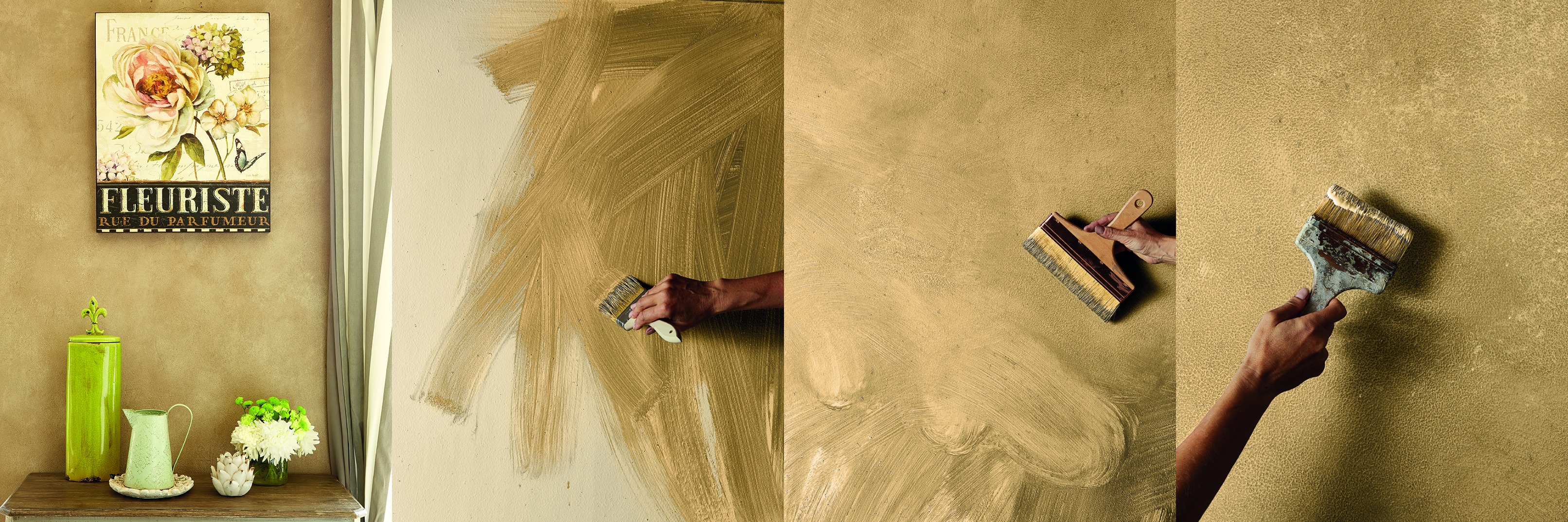
Connected
This is a combination of timeless hues. Because of their earthy origins, it is good to team walls painted in these colours with bold, contrasting accessories to create extra interest.

Calm
Light blues and greens create a sense of peacefulness. “These colours bring balance and harmony to a room”, says Anne. “This palette also includes gentle sky blues to create a feeling of space, relaxation and tranquility”.

Soothing
The colours in this set have been chosen for their therapeutic effect. We are normally attracted to colours that we need to bring emotional stability.

Confident
Tones of yellows and oranges make spaces more inviting and add warmth. “They go well with other colours, but you can easily use them in a monochromatic scheme.

Airy
These soft hues, which range from pale minty green to subdued cream, add an ethereal, calming presence to spaces, and look great paired with white. “White is the colour of peace, purity, innocence and tranquility. It encourages openness and freedom and gives you space and time to reflect on your life,” says Anne.

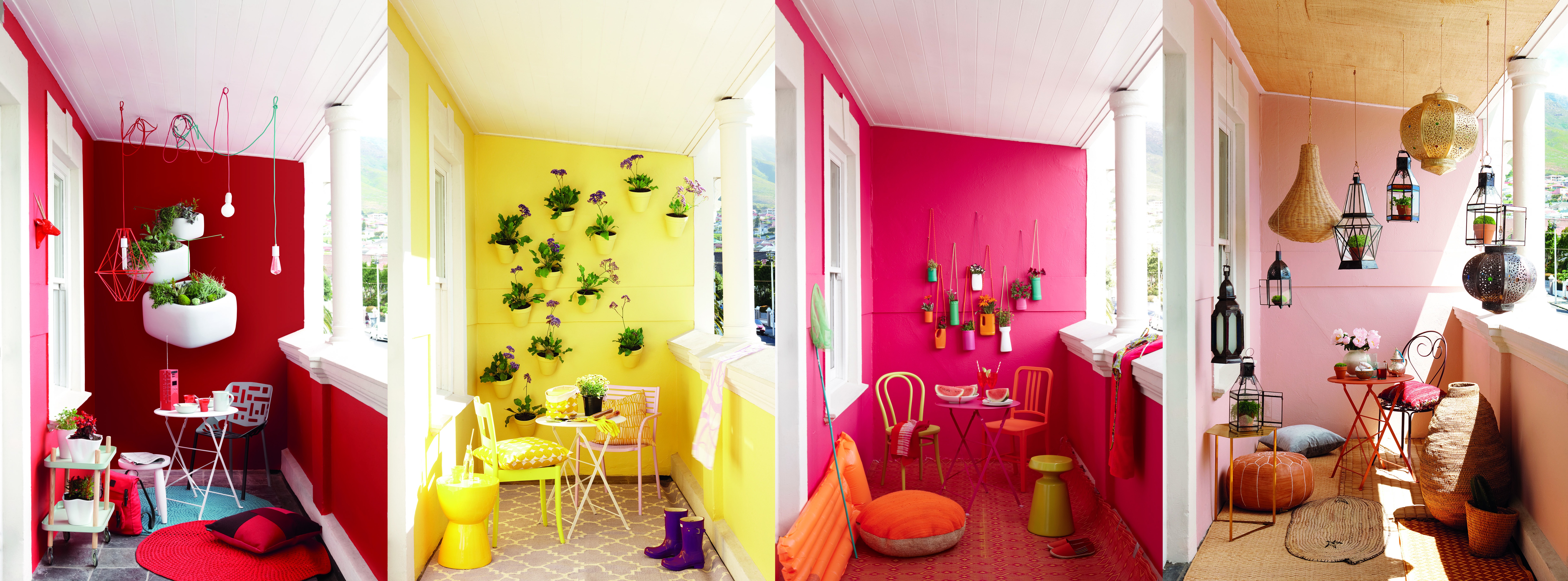
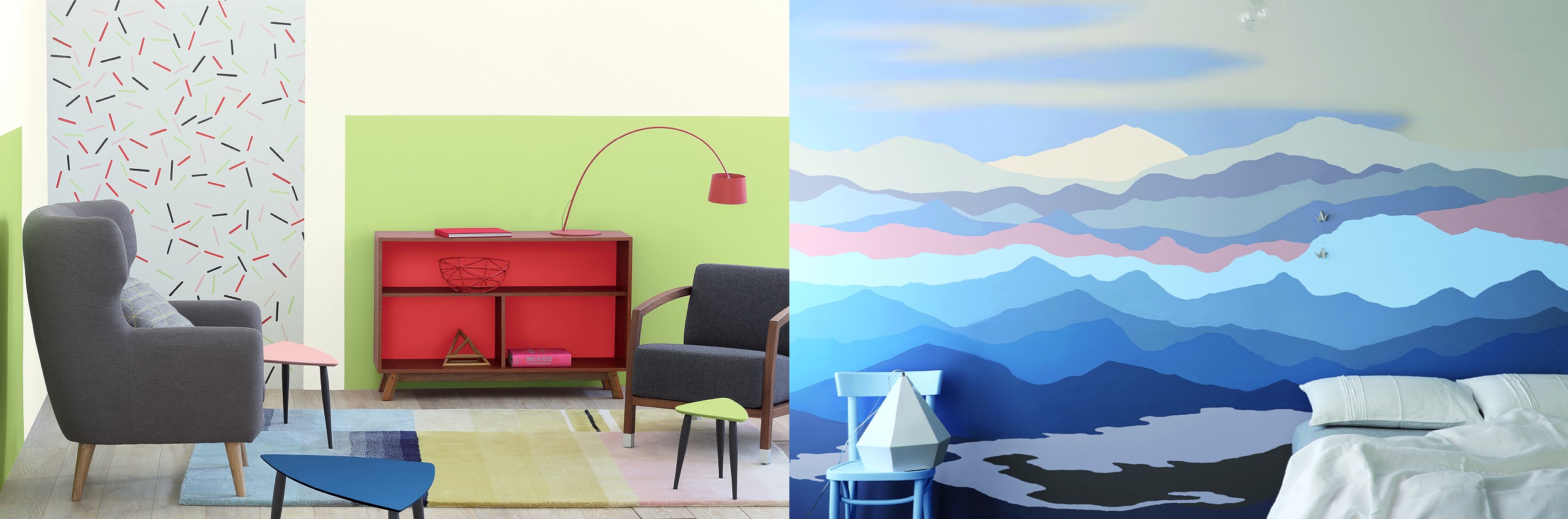
Bold
These vivid brights are great for colour –blocking and making a statement, whether you’re painting a focal wall or a piece of furniture. Bold colours, especially reds are stimulating and awaken our physical life force.

Gentle
Inspired by the natural shades of beach sand, shells, driftwood and pebbles, these gentle neutrals are as versatile as they are beautiful. “When using them, think of including different textures such as sisal and lamb’s wool to create interest, “says Anne.


Leave a Comment