
Last month, we explored the effect of colour on our moods and thoughts and looked at how to use rainbow hues in the home. Next up, mixing and matching with flexible neutrals…
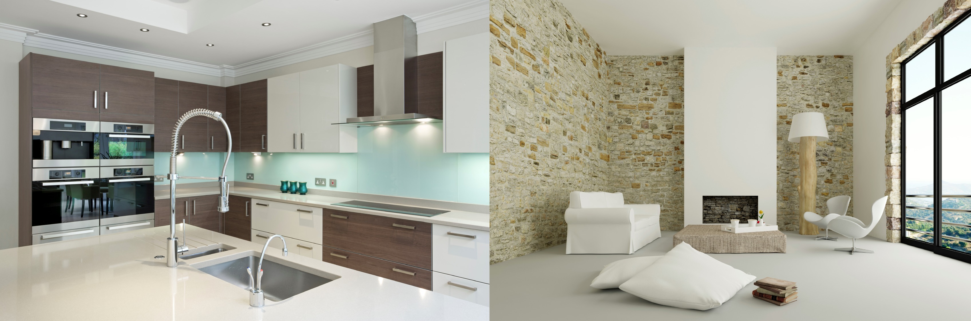
White – Creamy white, cool white, warm white, soft white, bright white, ivory – who knew white had so many faces! White can be soothing and fresh. It can also be stark and sterile. It’s a good choice for bathrooms and country-style kitchens, and it can be beautifully calming in a bedroom. Anchor it with a bold accent colour like black or navy in a living room and bring in accessories with patterns and prints to add interest and contrast. Bright white works in areas that receive an abundance of sunlight. It can make rooms seem larger and more spacious. It’s a good choice if you are an art collector as it provides a gallery-style backdrop. If you want to bring out every grain in a piece of wood, set it against white. A bright white trim makes bolder wall colours stand out, enhances door and window frames, and highlights skirting boards and other architectural lines. Combine it with shimmering metallic accessories for a touch of glamour. Add both warmth and whimsy to a bedroom by layering different whites with soft furnishings, flowy fabrics and white floorboards.
Black – A bold colour, black is confident and self-assured. It implies sophistication, elegance, power and mystery. Black can shrink and darken a space dramatically if used incorrectly, but it can also look sleek and dynamic. It works well in kitchens, especially on the floor in a timeless black-and-white checkerboard pattern. Good lighting and ample room is needed if you want to bring black furniture into a space. You can use it in a teen’s bedroom – just add pops of bright colour and quirky accessories to keep the space from feeling too dark and heavy. Feng Shui principles recommend a glossy black front door, especially if it faces north, to create a protective, solid energy in your home. A row of black art frames with vibrant images can bring life to a blank wall, or paint a whole wall with chalkboard paint and let the family get creative. It’s also a good colour for ‘separating’ and ‘transitioning’ from living area to dining area etc, in a more open-plan setting.
Grey – The ultimate background colour, grey is often considered bland and boring. On the flipside, it is timeless and practical, and plays well with other colours. It is associated with stability, sensibility and formality. Like white, grey has many faces – from dove grey to slate grey, charcoal grey, pewter and more. Use it in spaces where order and calm is required. It’s a good choice in kitchens and bathrooms because it’s not as sterile as white, but still evokes ‘cleanliness’ and works beautifully with modern appliances, bathroom accessories, glass and mirrors. A grey nursery with hints of colour here and there will result in a soothing space that won’t overwhelm little senses. A close relative of silver, use metallic accents and reflective surfaces to make grey come alive. Pair it with pink for a feminine bedroom that still wants to be taken seriously.
Brown – The colour of coffee and chocolate, brown is warm and inviting. It brings us down to earth with its grounding influence, making it the perfect choice for areas in the home where we are most relaxed. We can also use it to showcase all things African, with her varied landscape and home-grown arts and crafts. Use browns in rooms with exposed brickwork or consider horizontal wood panelling on a feature wall. Mix and match brown with blue (especially teal), green, gold, red and orange. Look for natural fabrics, wood and leather when using browns in living areas. Hang pictures with sepia finishes, as opposed to full-colour or black-and-white photos, to complement other browns in the room. When painting brown on walls, opt for a satin finish as matte sometimes look flat and ashen.


Leave a Comment