

Whether botanical-inspired or reminiscent of a tropical sunset, bedrooms are sensory-based havens. There’s no better way to add a touch of interest to your bedroom than painting your walls in a colour that reflects your personal style.
In harmony
Mindfulness and individualisation. These are some of the drivers compelling us to transform our bedrooms into personal sanctuaries.
“Keeping your room monotone is a great way to add a sense of depth and dimension. Shades of whites and naturals are go-to colours in this regard,” says Stacy Nel, marketing manager at Volpes.
Adobe Stock
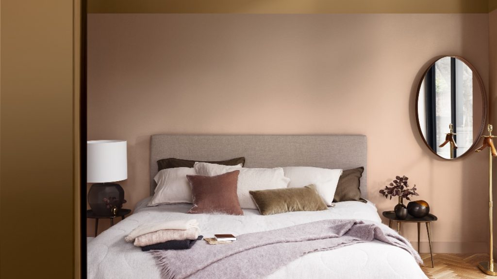
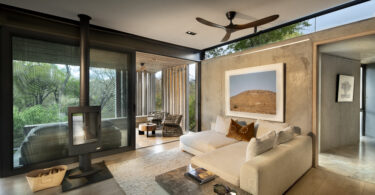
Greige matters: In contrast to other cooler shades, greige has a warm, soothing undertone. The shade of the moment is calm and cocooning, yet invokes a sense of modern, pared-back style.
Ravine 62, Kensai Plascon colour of the year for 2019, www.plascon.co.za
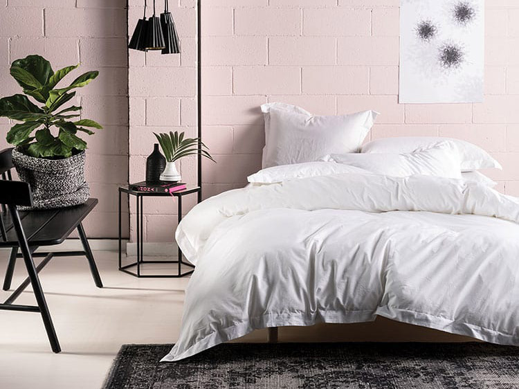
Oh honey: Welcome golden rays of sunshine to your abode with amber-toned neutrals. They’re guaranteed to add a much-needed feel-good element to your morning mix.
Crème Brulee, Dulux colour of the year for 2019, www.dulux.co.za
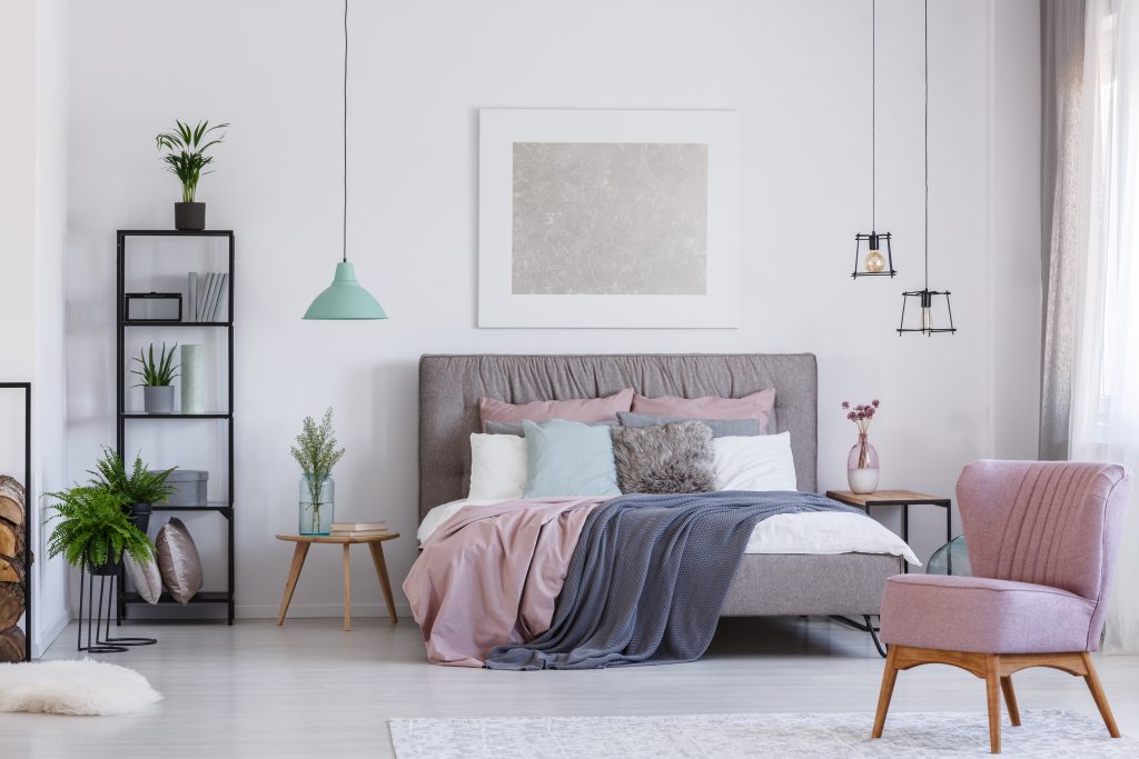
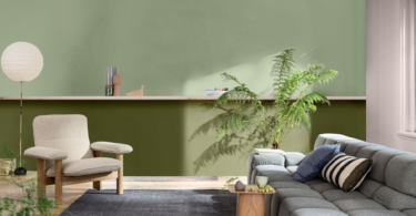
Perfectly pastel: For a fresh, breezy touch, use neo-pastels as the core neutral. Not only are barely there pastels on-trend, they help create a sense of calm.
Nara Bamboo Duvet Cover Set, www.linenhouse.co.za
TIP: Before choosing a wall colour, measure the amount of natural light your room gets and the direction the light comes from.
After-dark appeal
Those who shy away from anything pink and pretty will find solace in a palette of moody hues. “Painting a feature wall or an entire space in a dark shade creates a sense of high drama,” says Nel.
Monotone magic: “For something masculine, go monotone with darker shades like grey or midnight blue. This really suits a more modern style aesthetic,” suggests Nel.
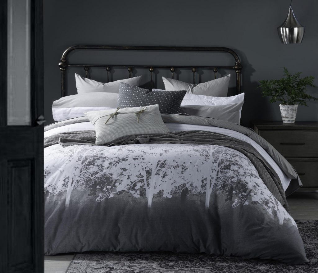
Dalton duvet, www.volpes.co.za
Graphic design: Dark walls have many personas. Feminine patterns and prints are a great way to liven up a monochrome space.
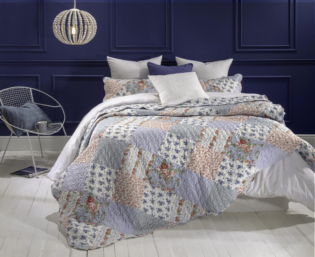
Lillian quilt with Viola Blue scatter, www.volpes.co.za
Primary selection: “Make the ultimate style statement with matching walls and linen,” suggests Nel. Up the ante with small pops of primary colours.
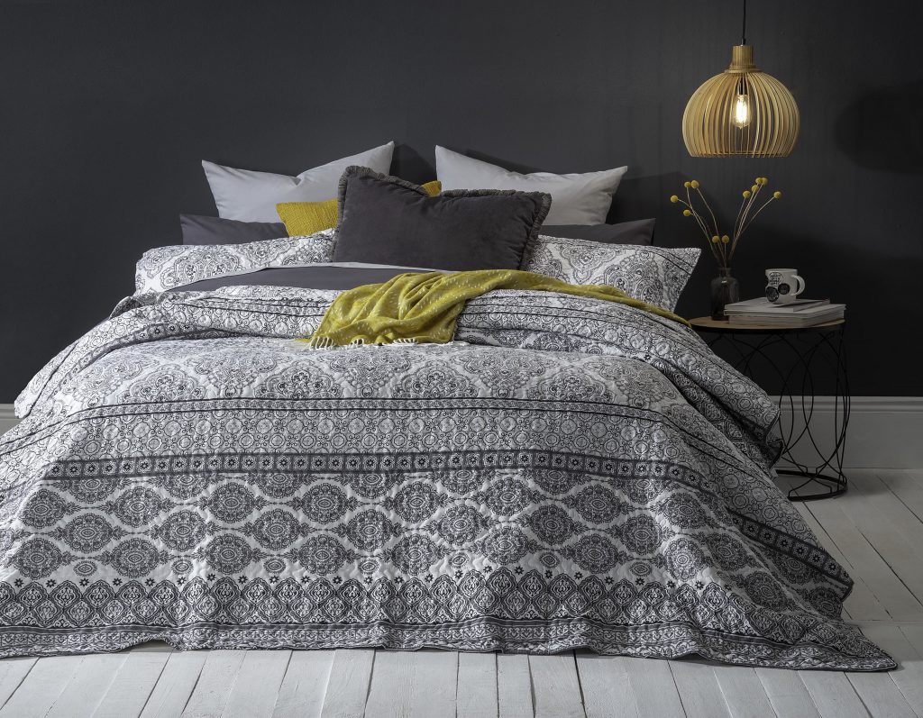
Lotus quilt, www.volpes.co.za
TIP: When choosing the right neutral as the base palette, consider undertones and colour temperature. Grey has a cool undertone. On the opposite end of the spectrum is beige. In between is greige.
In living colour
While larger bedrooms present more opportunity to incorporate different shades, Nel advises incorporating colour sparingly to liven up small bedrooms. “Bright bold colours can make a room look smaller. But if you love it, paint an accent wall in a statement colour and pare it down with white-framed artwork,” she says.
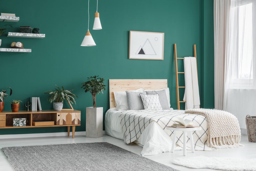
Botanical beauty: Breathe life into your personal haven with a sophisticated woodland palette of deep, rich jewel tones like dark teals, hunter’s and emerald green.
Adobe Stock Photographee.eu
Ocean vibes: Swirls of blue-green like turquoise, teal, and aquamarine epitomise tranquillity. Ideal for urbanites dreaming of beachside living.
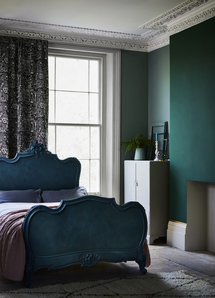
Bed, Annie Sloan Chalk Paint™ Aubusson Blue; wall Annie Sloan Chalk Paint™ Amsterdam Green
Breaking the mould
There’s no need to choose between a muted or bold colour in your bedroom. Here’s how to play around with interesting combos, from head to toe.
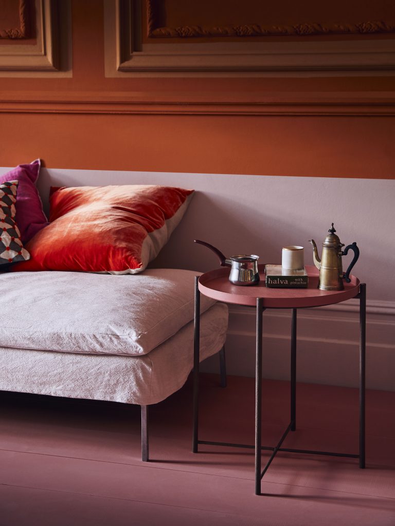
Opposites attract: For a twist in the tale, consider pairing complementary colours – those opposite each other on the colour wheel. Smoky purple and ochre, for example, make a cool combo.
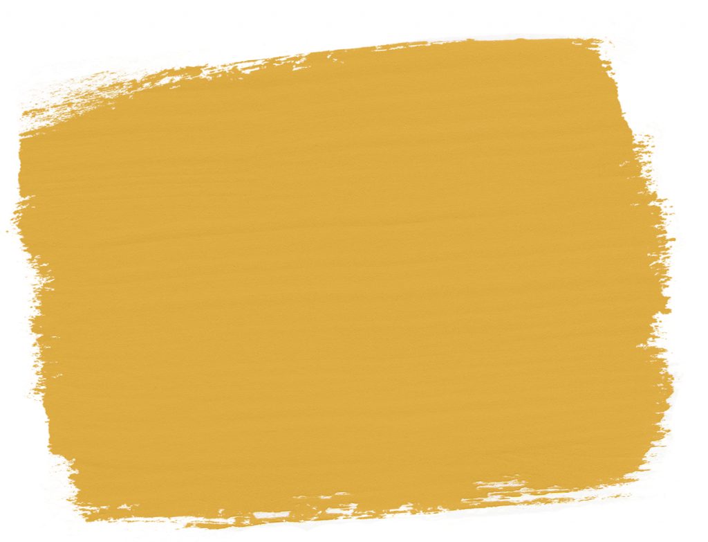
Annie Sloan Chalk Paint™ Arles
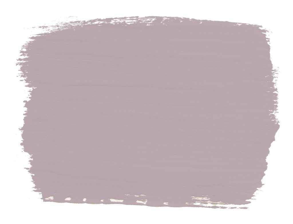
Annie Sloan Chalk Paint™ Paloma
A masterclass in contrast: Ceilings are often overlooked when it comes to making a design statement. So rise to the occasion by painting yours in an on-trend terracotta shade, suggests Karin Cawthorne, owner of KARE. Add contrast by painting door frames, skirting boards and mouldings in a striking colour or on-trend neutral.
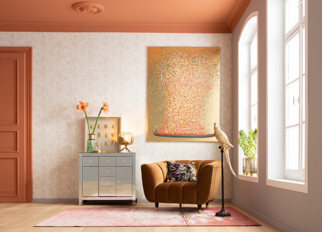
Shop the look at KARE, www.kare-design.com/za
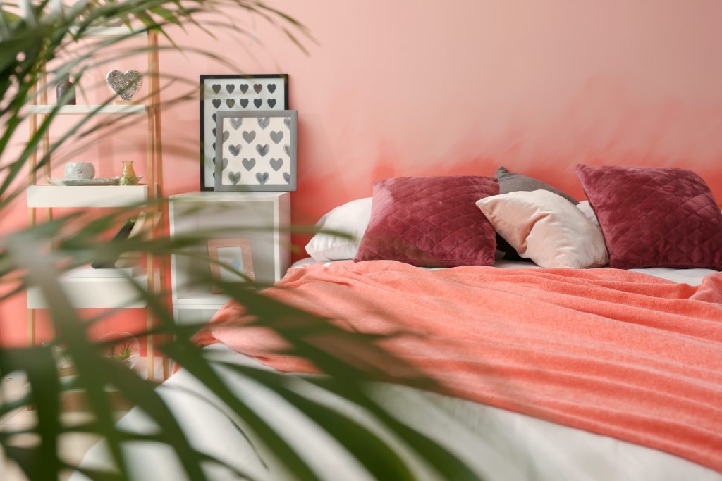
Exotic appeal: If you’re looking to spice things up look no further than Living Coral – Pantone’s colour of the year. According to Annie Sloan, owner of Annie Sloan Chalk Paint™, this vibrant, almost neon coral “conjures up the flavours of India and Morocco, of spices and sunsets”. In this exotic room, blocks of colour in a palette of Antoinette, Barcelona Orange and Emperor’s Silk Chalk Paint™ packs a punch.
Annie Sloan Chalk Paint™
Good bedfellows: Living Coral is the perfect tropical sunset shade. “Contrasted with dark tones navy or dark-green walls will let this vibrant shade pop into high focus,” says Nel.
Adobe Stock


Leave a Comment