

Want to inject some pattern and texture into your living space, but don’t know where to start? Read on for tips to get it just right, without going overboard…
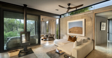
1 Texture is about more than just ‘touch and feel’. The right combination of textures can create comfort, act as buffers for sound and give a space greater depth from a visual perspective (as opposed to if it was filled with only ‘flat’ surfaces).
2 Try mixing and matching different textures with one another – soft (velvet cushions), natural (branches in a clay vase), shiny (mirrored surfaces), rough (fibre rugs) and smooth (leather couch).
3 Or you can choose one kind of ‘texture theme’ (say, natural) and layer it up – think woven blinds, wood panelling, grassy rugs over a cement floor, stone tables, etc. A lack of layering can leave you with a stark and uninviting space.
4 Look to less-obvious places like the ceiling to bring in texture by using plaster moulding or exposing wooden beams. You can even take it down to the walls with textured wallpaper.
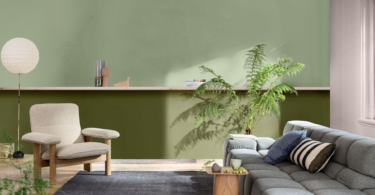
5 Do you have a very neutral living room at the moment with clean lines? Spice it up with a colourful patterned rug (botanical prints are very popular at the moment). If chosen correctly, a rug can really carry a living room. A plush rug, for instance, always feels welcoming underfoot from a textural perspective too. And bigger is definitely better when it comes to living spaces (where at least the ‘front feet’ of your lounge suite sits on top of the rug).
6 While layering patterns works with walls, floors, upholstery, ceilings, window treatments and accessories, it’s best to take baby steps when first trying it out. Start with patterned scatter cushions and work from there. It’s one of the more ‘budget-friendly’ cosmetic updates you can make to your living room. Ottomans can also add both pattern and texture to a space without breaking the bank.
7 Another way to bring in patterns, especially if you’re a novice, is to stick with a simple main colour palette for your larger pieces of furniture and infuse a touch of pattern here and there with accessories, such as a bold floor lamp or painting.
8 Sometimes the more colour in a print or pattern, the easier time you will have pulling in other colours (which don’t have to match exactly, by the way, but just have to blend well to the eye).
9 You want a mix of small, medium and large when mixing patterns. If all of your prints are the same size, your eye won’t know where to look and nothing will stand out. So vary the size of the patterns you choose.
10 Similarly, vary the style of the patterns. If you started with a floral then your next pattern could be a stripe, something plaid or even geometric. Your patterns need to complement one another too, so if one is very bold, the other shouldn’t be too busy.
What’s hot right now?
• Geometric décor and objects finished in metals, mixed with natural timber and stone finishes to furniture and cabinetry.
• Metallic colours through the use of fabrics, wallpapers and artwork.
• The raw, industrial appeal is still going strong, with concrete, clay, copper, glass and steel remaining a material focus.
• Livening up living spaces are exotic jungle prints, psychedelic colours, strong geometrics, soft water colours and gold accessories.
• Velvet fabrics in rich, deep tones.
• Florals, stripes and abstract patterns – all of these in both monochromatic hues and full-blown colour.


Leave a Comment