
One of the easiest and most dramatic ways to transform the look and feel of any space is with a “paint-over”. We spoke to five paint experts who share the latest paint colour trends with colours that will invigorate any tired space.
Calming neutral
“Designing a space is often as exhilarating as it is daunting. The investment of precious time used for the creative planning process, sourcing items and piecing your choices together is often worth more than the price tag attached to each of your carefully curated items.
“Where to begin is often the go-to question, and with interiors the answer is always colour. The cornerstone to every trend, colour is irrefutably the most powerful and influential tool when reimagining or designing a space.
“There are some incredible options for this season – using earthy, neutral tones as a base seems to be the most popular by far. Neutral colours will forever be a superb option to craft your home décor decisions around due to their kind and welcoming nature. Neutrals are also great for allowing prominent or accent colours to be brought in and give one endless ways to creatively combine practicality with staying on-trend, due to their subtle nature and vast pairing abilities.
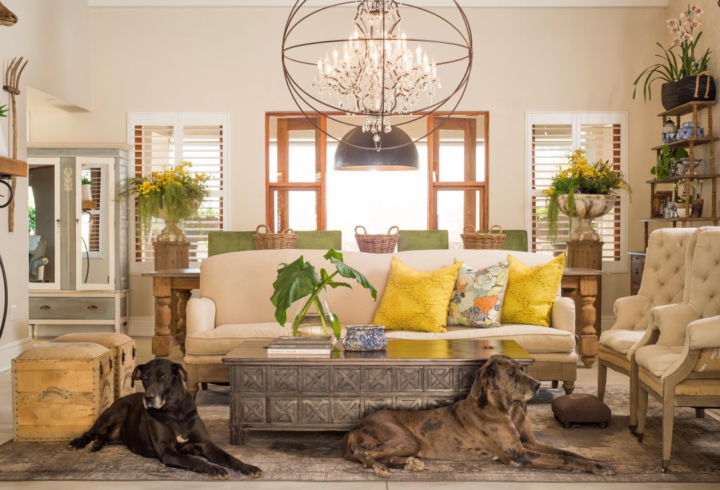
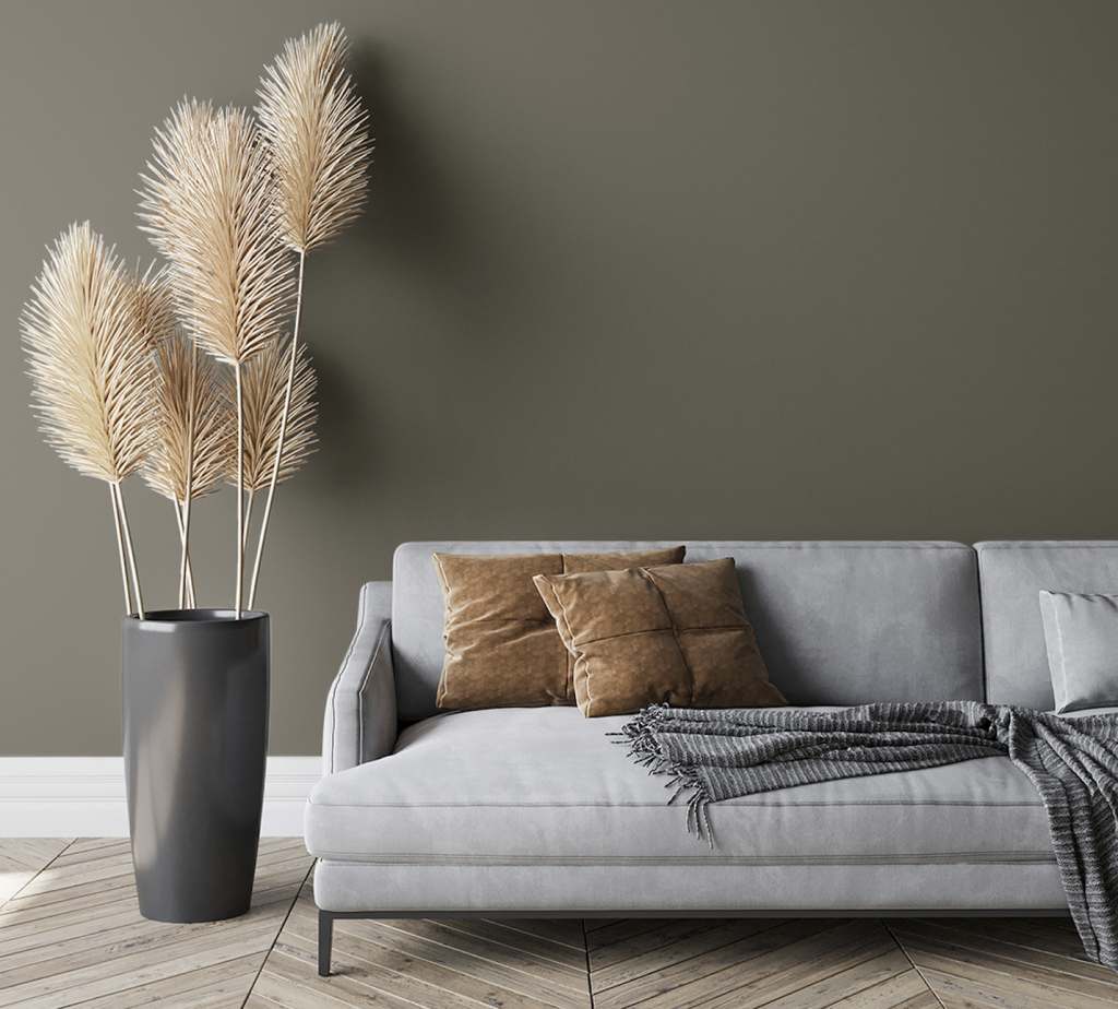
“This open-plan lounge was painted with a base of Tjhoko Paint colours for walls in Lourain’s Cream for a warm welcoming appearance with white accents in our subtle off white colour, Da’vid. Colour was carefully added with the use of large throw pillows, mixing patterns and colours for a sophisticated, playful look.
“Subtle hues of blue and green are repeated throughout the room in plants, accessories and fabric, grounding the welcoming feel and adding charisma to the overall personality of the space. The addition of these natural tones complements the natural textures in the wicker blanket basket placed by the fireplace and the worn wooden ornate coffee table.” – Nadine Vosloo, creative director, Tjhoko Paint
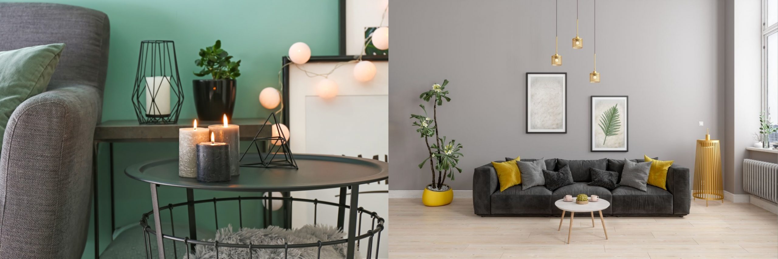
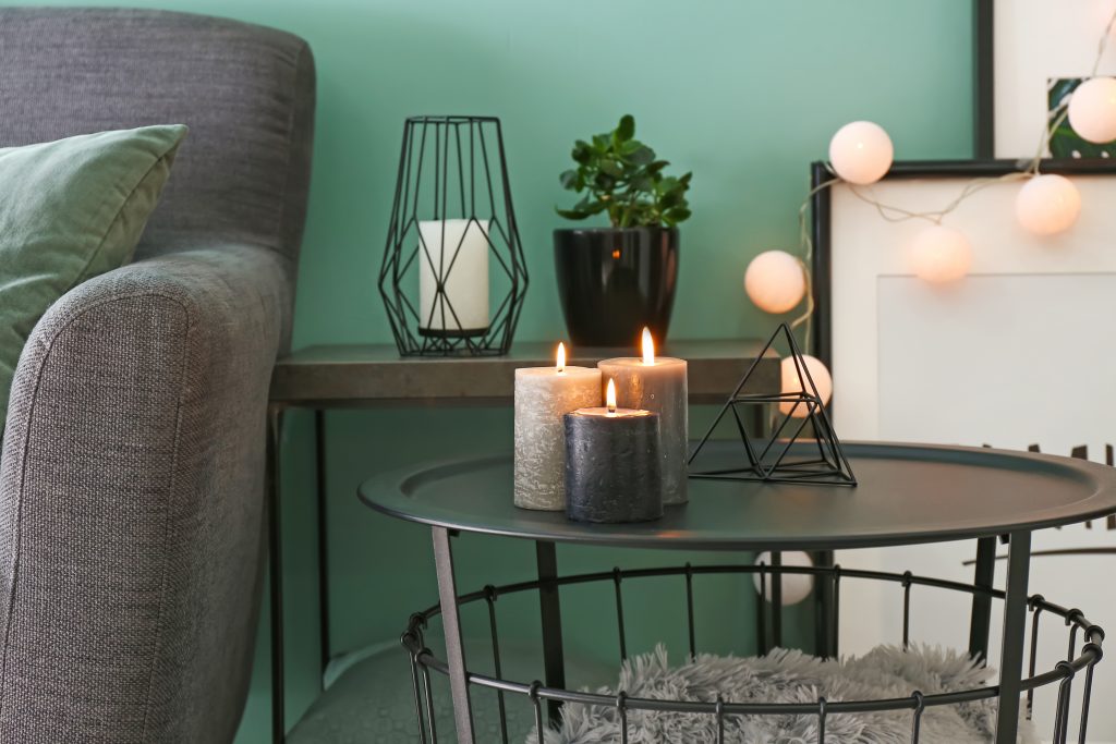
Gorgeous green
“A revitalising palette featuring seafoam green is a colour trend we will see in many spaces well beyond 2021. This shade evokes the feeling of the fresh sea air that emits tranquillity, peace and style throughout the home.
“During these tumultuous times, we will see soothing colour trends taking centre stage in our homes. Seafoam green works particularly well in the kitchen, bathroom, or as an accent wall in living areas because of its clean attributes.” – Shannon Prestia, marketing manager, Versus Paint
Nature-inspired
“Grounded tones – serene and peaceful – are the cornerstone of making over and upstyling rooms with paint. With consumers craving simple comforts and a slowed-down lifestyle, the new neutrals are earthy and pared back. Organic palettes that represent simplicity and restfulness are in; natural hues that are restorative, compassionate and optimistic.
“The colour trio that best represents this is the PPG Be Well palette which celebrates beauty and emulates the optimism and soothing nostalgia felt in nature, and include Transcend, Big Cypress and Misty Aqua. Not just this – these colours are for people who want to prioritise wellness of mind, body and spirit.
“These colours pair well with greenery, blonde or natural brown-toned woods and layers of texture in the form of rattan, linen, velvet and woven textiles like pillows, blankets and rugs.” – Herman Rabe, technical training manager, Prominent Paints
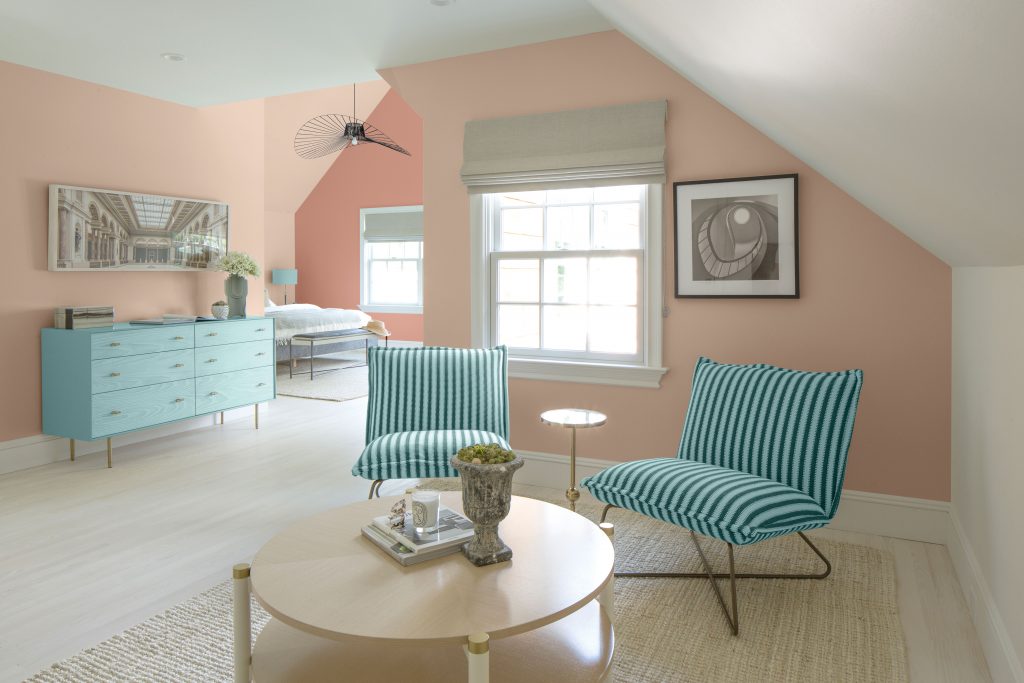
Glorious grey
“Get the best of both worlds by applying warm grey tones to your walls this season. Warm greys harness the sophistication and elegance of greys along with the versatility and softness that warm neutrals deliver.
“A warm grey shade is not only beautiful but also practical as it pairs well with other colour families and allows your bold colour accents to shine. Ideal for living and dining room spaces.
“Create a relaxing space by pairing warm greys with complementing natural and neutral tones – perfect for a restful bedroom retreat. Fur Seal from the HABITAT Colour Collection is a luxurious grey that replicates the rich coat of the sea mammal it is inspired by.” – Anel van Niekerk, brand manager, Duram Smart Paint
Colour pops
“Colours are not just a decorative medium; they influence our emotions and play a part in making us feel secure and happy. With one cancelled holiday after another – and plenty of time spent at home over the past 18 months – transforming our living spaces with colour has become a trend in and of itself. Creating the ideal place to live, work and play has been inspired by our need for peace in our daily lives, as it’s more important than ever to look after our well-being.
“Although there’s been a big move to serene knocked-back colours like subtle greys that create a calm base to build décor schemes on, there’s an equally strong move to brighter colours that introduce cheerfulness to our lives.
“With no end in sight to the current status quo of lockdowns, one can expect to see a combination of calm hues with pops of bright colour that uplift and add joy in the foreseeable future. Pops of colour may be added as accent walls or in painted furniture and décor.” – Lani Carstens, marketing manager, Rust-Oleum


Leave a Comment