Looking for a cost-effective way to update your home? We share exciting new paint colour palettes and how to incorporate them into your living spaces.
Connect with nature
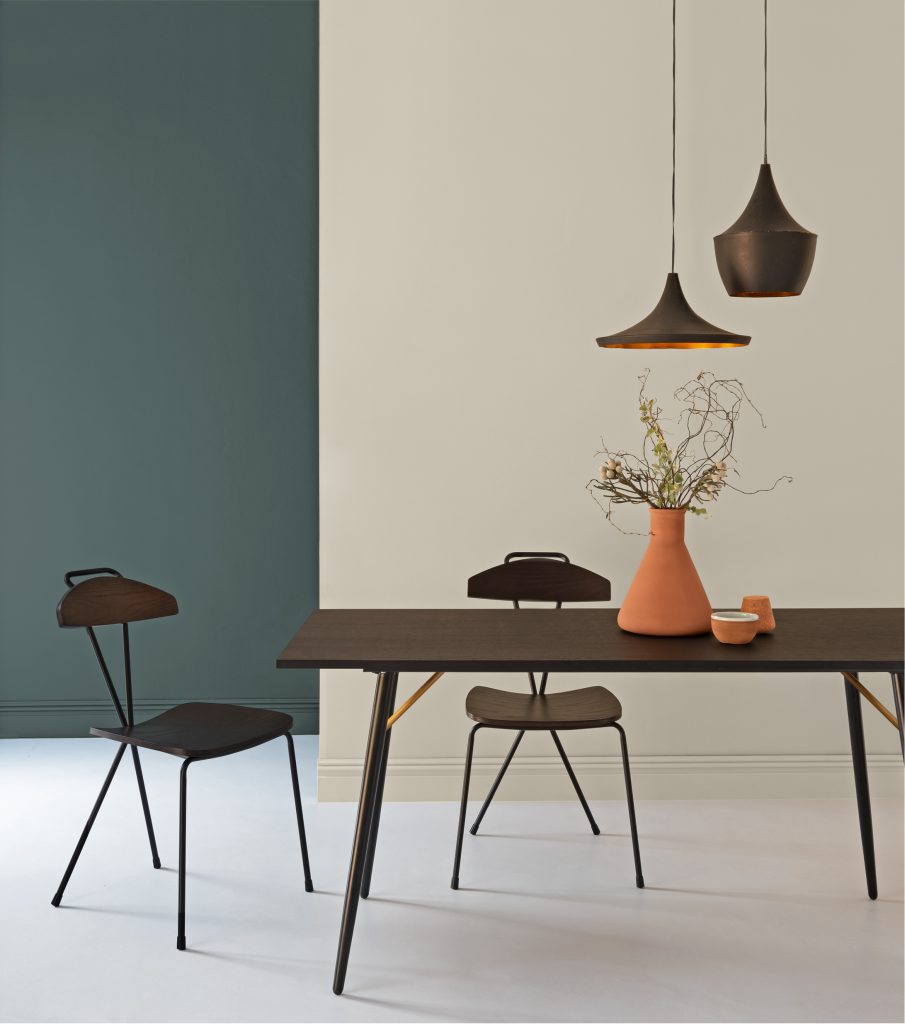
The colours for 2020 are inspired by nature and fulfil our desire to reconnect with the outside world and live more consciously. There is a trend towards earthy tones and warmer, neutral hues like warm greys and browns. Lauren Lambert, Duram brand manager, suggests trying Duram’s Habitat Colour Collection which is a curated palette inspired by beautiful natural habitats. You can replicate these balanced and harmonious tones in your home. “Choosing the perfect colour couldn’t be simpler with these 90 timeless yet contemporary colours, ranging from subtle earthbound neutrals to dark inky hues.”
Experiment with samples
Colours look different in small swatches, and lighting and surrounding colours greatly affect how we interpret colour. Lambert recommends trying a colour sample before committing to painting an entire room or space. “Each colour from the Habitat Colour Collection is available for purchase in a convenient and affordable 90ml low-sheen colour sample. Paint a test patch of your favourite colours on different walls in the room, test with your décor and see how the colour subtly adapts to the changing light throughout the day.”
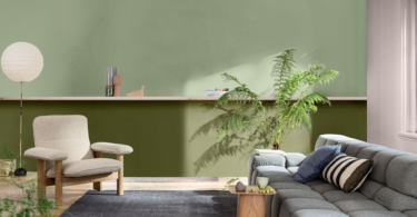
Make your space exciting by painting a two-toned wall
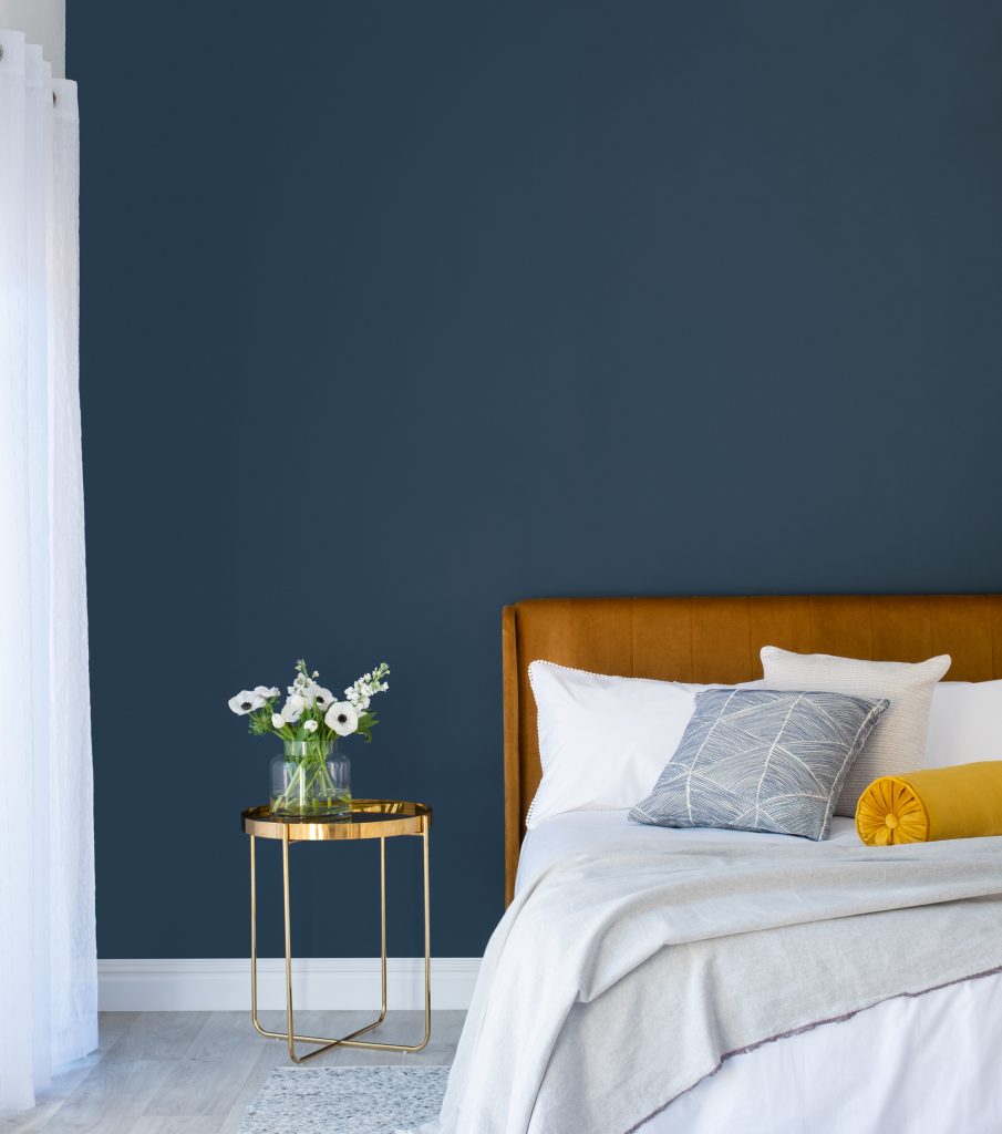
Decorating a room with two-toned walls adds dimension to your space while updating the colour palette, so you can have both of your favourite colours without having to compromise. Palesa Ramaisa, Dulux colour expert, says to save costs you can even do them yourself, rather than asking for professional help. “The most important thing is to choose colours that complement each other; otherwise the entire concept of two-toned walls won’t make sense. You can always choose two neutral colours to stay on the safe side, and enrich the look with playful curtains, bold pillows, or other interesting accents.”
Try something different by including horizontal or vertical stripes
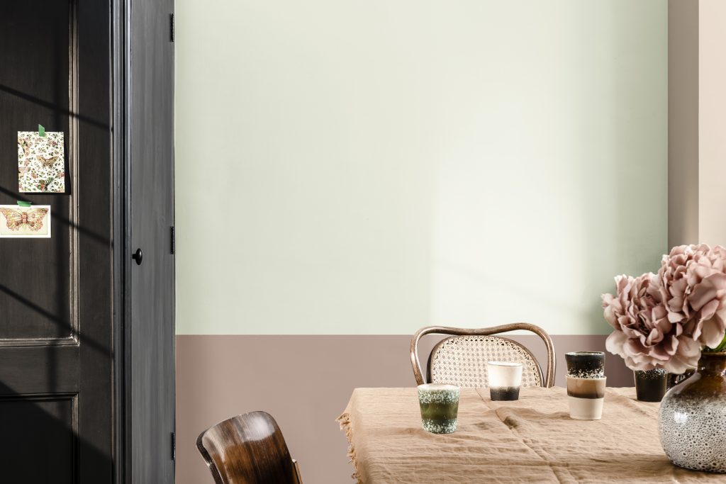
Stripes are a great decorative painting technique and will give your blank wall personality and update the colour palette. Ramaisa is a fan of stripes. “Horizontal stripes make a room appear more spacious; vertical stripes make the ceiling appear higher. Striping is a very simple technique and the final effect can transform the perceived size and dimension of a room. Just remember to measure and tape carefully.”
Opt for cooler tones
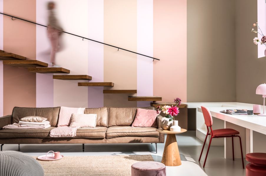
In this time of social, informational and emotional overload, the world sees a rise in the search for wellness and other self-preservation tactics. We are burnt out from the pressure, fear, anxiety and constant sense of uncertainty. People yearn for community, connection and peace. Colour has the ability to fulfil some of these longings. Nozipho Kunene, Plascon’s colour advice team leader, says the cooler tones in Plascon’s Gentle Serenity palette bring peace and the tranquillity of an oasis to your space. “We have selected fresher tones of blues and greens to modernise the pastel palette concept. Ask a child and they will tell you: ‘Yellow is the colour of sunshine.’ We believe the soft yellows and neutrals we have selected epitomise warmth, happiness and joy. Pinks and lavenders are no longer ‘girly’ colours – and these warm hues bring healing, comfort and security.”
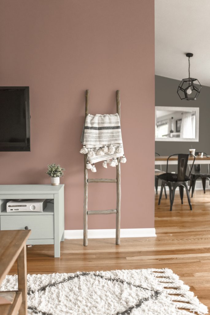
Featured image: Dulux


Leave a Comment