
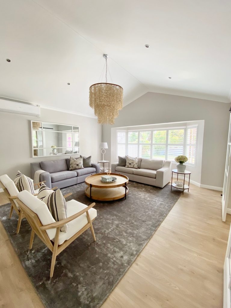
Is your living room in need of a makeover? Learn how to choose a colour scheme to create a cosy and welcoming space.
Work with your existing colour scheme
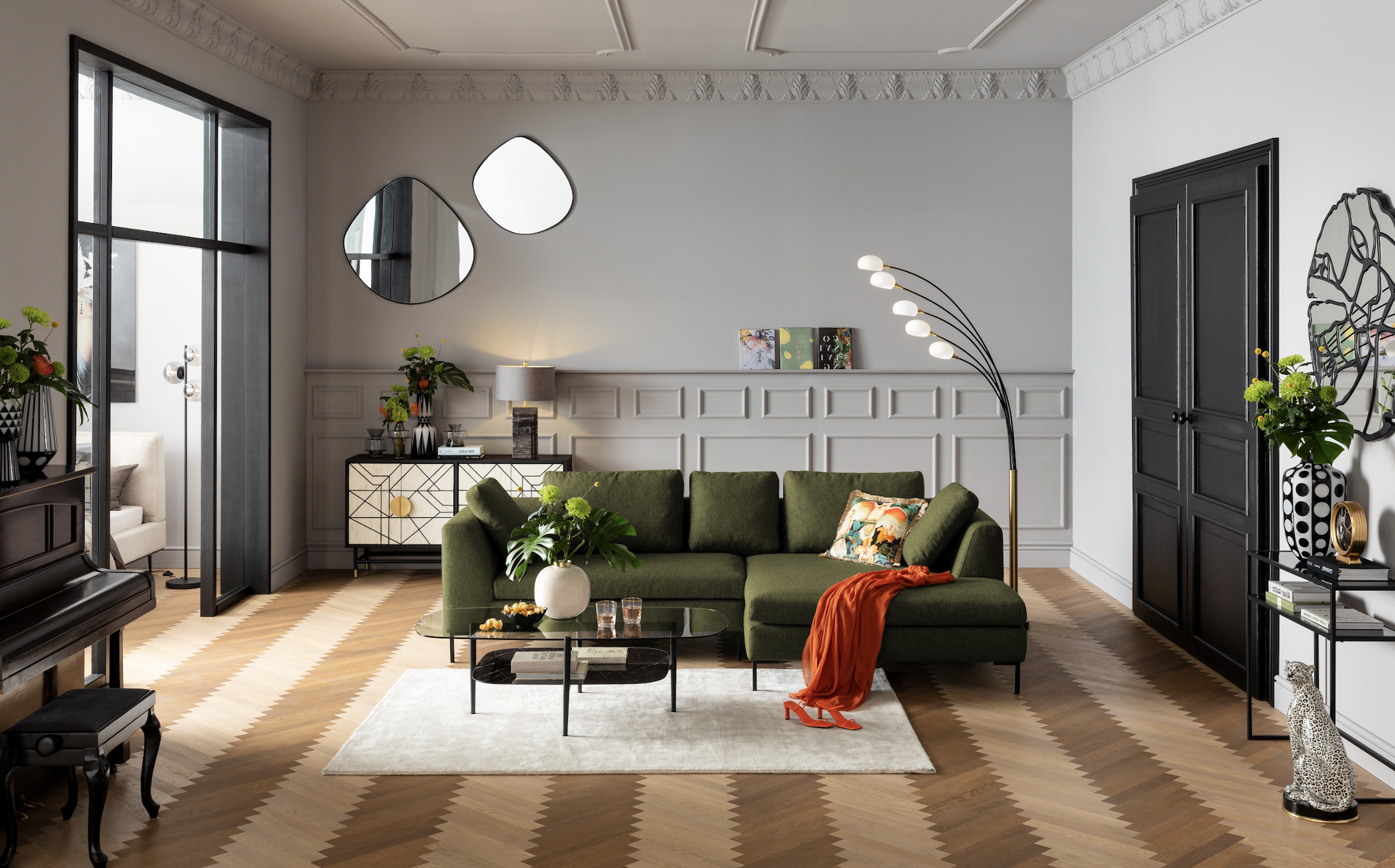
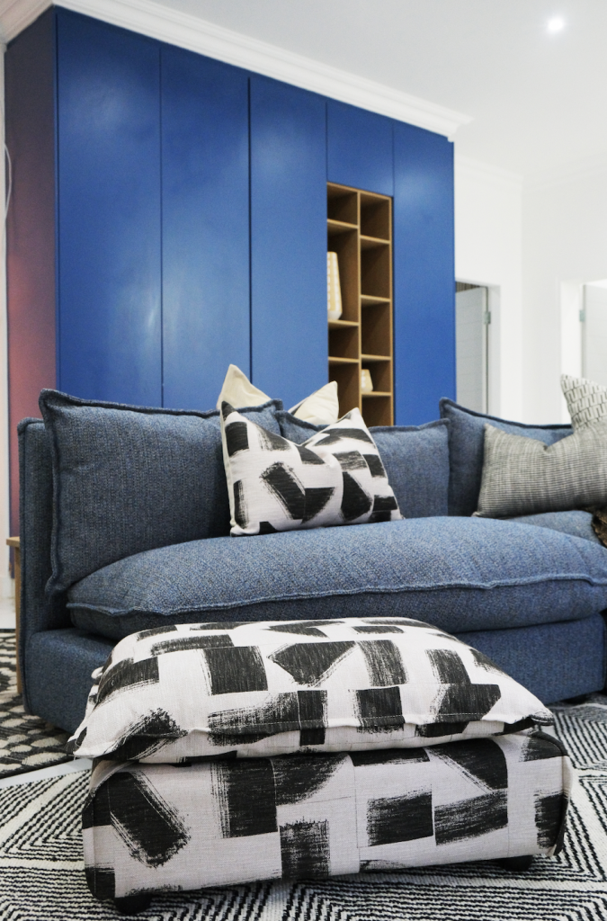
“In my experience, the best way to plan the colour scheme of a living room is to take the recurring colour throughout the house and use that as a base colour on your big furniture items. Then use colour and patterns on your smaller décor items like scatter cushions, rugs and small tables to create points of interest. Patterns on a big furniture item can be overwhelming, whereas patterns and colour on smaller items lift the big neutral colour pieces and are easier for the eye to digest.” – Lara Fourie, co-founder and lead designer at The Good Space
Delve into the dark
“In order to ascertain what type of atmosphere you want to create in a particular room, and how it will make you feel, I advise my clients to see how much sunlight enters the room. This will guide you in terms of the colours you choose. Bear in mind that dark colours are not necessarily only used in a lighter room. If you want a dark room to be more moody, you can use dark colours in the space.” – Christelle Afana Fonkem, interior designer and owner of At Home With Christelle
Consider mood
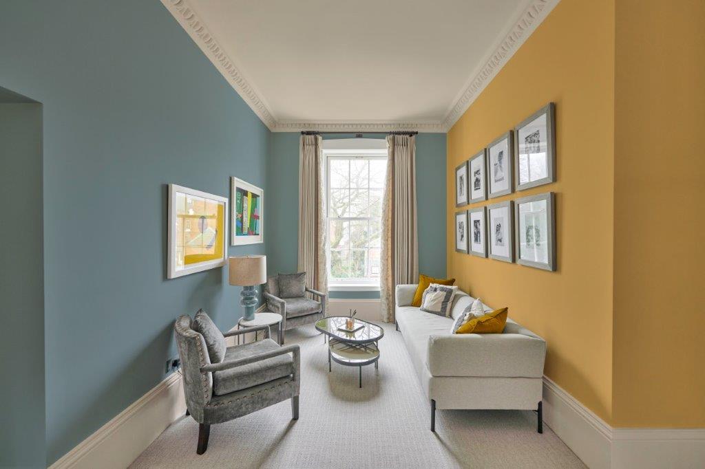
“Before you start, ask yourself want kind of atmosphere you want to create – colour has a big influence on the mood of a room. If you want multiple paint colours in your living room, choose your boldest colour first, and then select the others with the first in mind and always keep undertones (the colours beneath your favourite paint colour) the same. A simple beige may not be all that simple if it has a strong green undertone.” – Lani Carstens, marketing manager at Rust-Oleum
Use fabrics to guide your scheme
“Custom-made scatter cushions and upholstery pieces are the best way to produce a comprehensive look. Choose one or two patterned fabrics and use these to guide the rest of the scheme. Find colours and textures that all speak to each other, and then apply them in different areas of the space. This will keep the space interesting but have an overall balanced look.” – Kaylin Cameron, director and head designer of XIII Design Studio
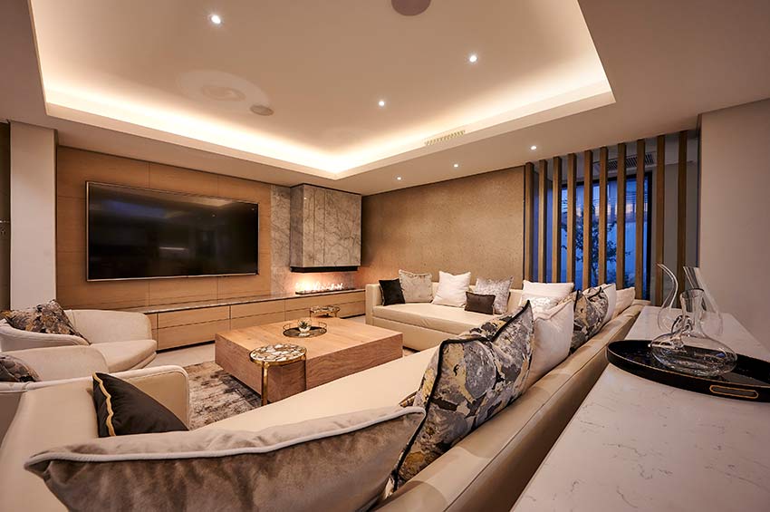
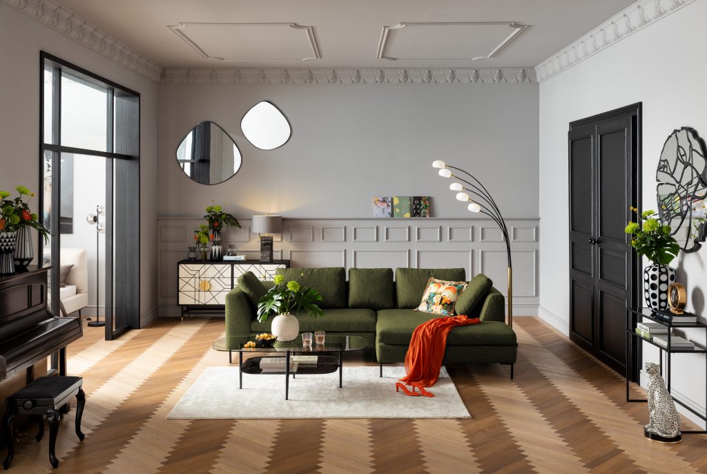
Incorporate warm neutrals
“Warmer neutrals have made a comeback recently. We’re moving away from the stark yet edgy shades that have previously dominated, with cosy spaces taking centre stage. Choose a neutral shade that appeals to you, and add furniture, wall art and deco items in your favourite colour scheme.” – Lela Sotyingwa, visual merchandiser at KARE Johannesburg
Choose colours that inspire you
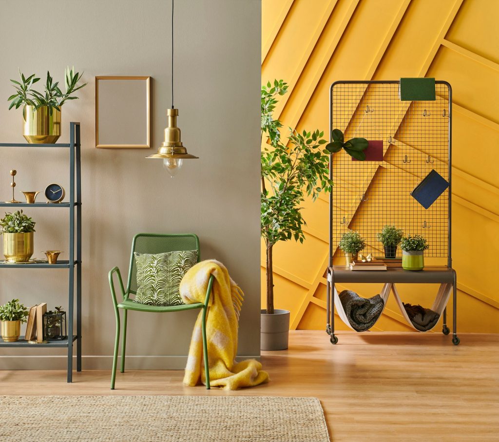
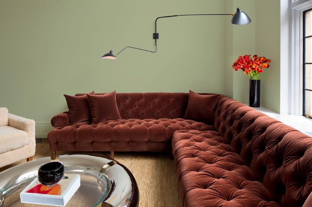
“After a long lockdown period, it’s time to choose colours that not only transform your space but elevate your mood – optimistic colours that boost your well-being while guiding you into a new era of design. Green is the colour budding everywhere; it’s on-trend and en vogue and represents renewal in a post-pandemic world. PPG’s Colour of the Year for 2022 – Olive Sprig (PPG1125-4) – delivers all that and more, and it lends itself to be paired with neutral or bold colours depending on your preference. Working like a neutral, Olive Sprig is a flexible hue that adapts to most environments, styles and usages.” – Herman Rabe, technical training manager at Prominent Paints
Go for colours that complement your personality
“When choosing living room colour schemes, select colour stories that resonate with your personality and your lifestyle. If you are drawn to colours that are warm and welcoming, then choose shades like PPG’s Yellow Coneflower (PPG1209-5) and Causeway (PPG10-28) and pair these elegant shades with delicate neutrals to create balance and to avoid a clash of colours. Colours that are grounded in tradition lend themselves to a more nostalgic look that has a calming restorative effect.” – Herman Rabe, technical training manager at Prominent Paints
Consider proportions
“When working with colour, the most important rule is to use your eyes. The right use of colour can correct or create a sense of proportion regarding the objects and structure in the space. Small objects can be made to appear larger with light, warmer colours, and large objects can be made to look smaller with darker colours. There are no bad colours, only bad combinations of colour.” – Leanne Van Niekerk, owner and designer at LVN Interiors


Leave a Comment