Discover 8 inspirational colour schemes for your lounge.
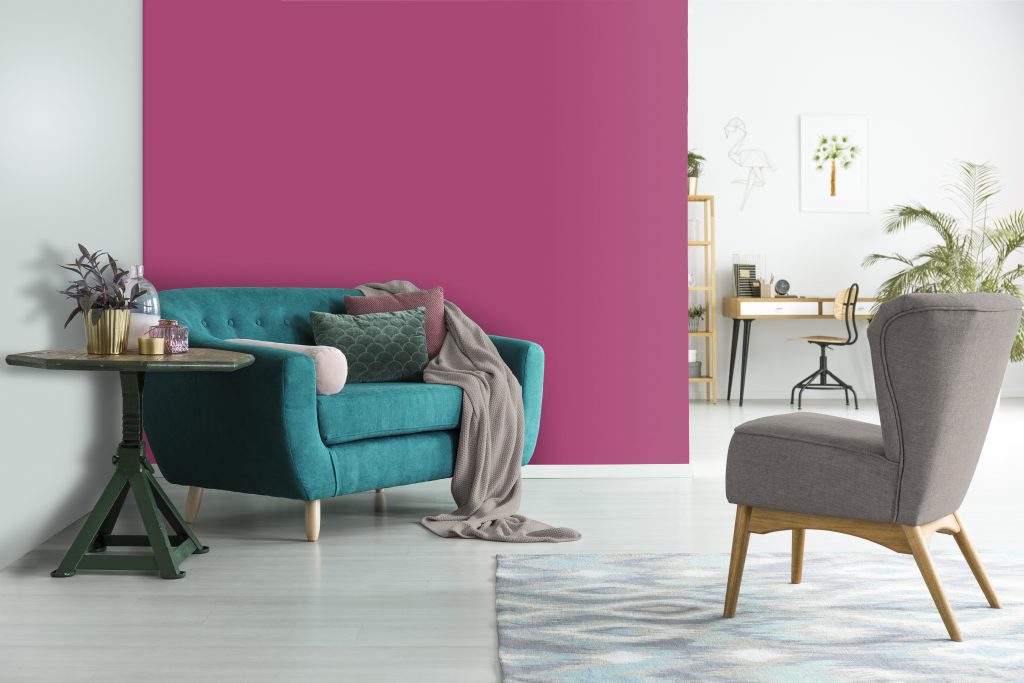
Go wild
Herman Rabe, Prominent Paints technical training manager, believes that just one happy statement colour can uplift an entire space. “PPG’s Be Wild colour palette is a combination of hues that activate optimism using big bold shades. Energetic in nature, the colours embrace joy and the hues are a celebratory expression of individuality and reclaiming power.
“For those with confidence who don’t shy away from colour, the expressive, bright and more playful colours are ideal for an informal lounge. A mood-boosting combination of colours. Use Transcend, the neutral earthy shade in this palette, to tone down or add balance to your inspired colour scheme.”
In this image cerise is a dark, bright, fun fuchsia pink with a magenta undertone. It is a perfect paint colour for Dorothy Draper-esque décor. Pair it with black and deep green for a chic look. Adding touches of Aqua Fiesta – a muted, tropical turquoise aqua with an aquamarine undertone – will add even more contrast and excitement to an already striking lounge.
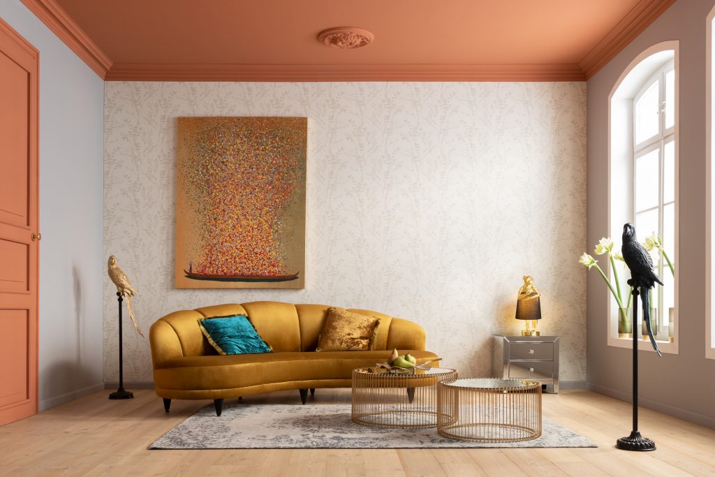
Bejewelled bliss
Karin Cawthorne, owner of KARE South Africa, is a fan of jewel colours with accents of brass and gold. “I believe that every space deserves a little glamour, and jewel colours are so in right now. Jewel tones with accents of brass and gold will also give your space that extra warm glow during colder months.”
Mushroom and metallics
Cawthorne loves to give mushroom grey an added edge with metallic accents. “Discreetly used, gold is a flattering contrast to vibrant and unique structures, but pairing bold with bold can be quite overwhelming for some.
“If this is the case for you, I suggest opting for a more neutral colour like mushroom grey. Pairing it with metallic accents will give your space more depth. This also allows you to step out and have some styling fun with creatively shaped décor.”
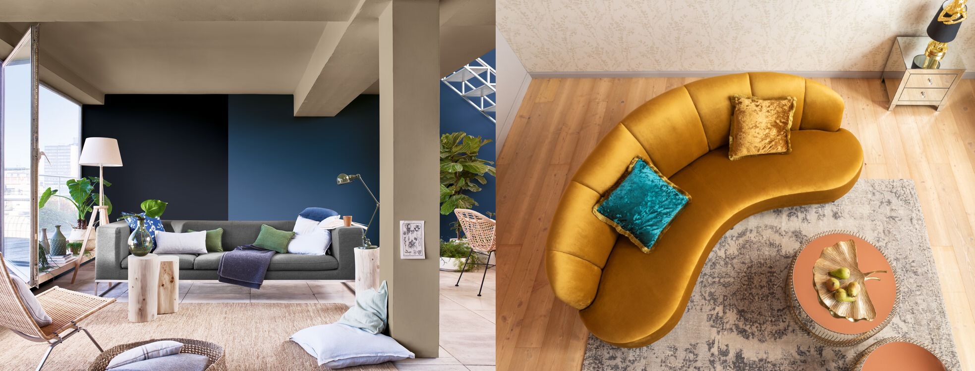
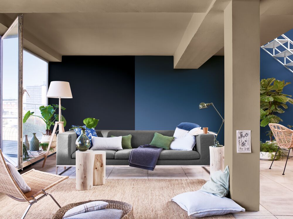
Breaking ground
Palesa Ramaisa, Dulux colour expert, is excited about the warm earthy tones such as Dulux Colour of the Year 2021 Brave Ground™ paired with different shades of blue. “This creates an open interior space that is airy and inviting which is perfect for open-plan lounge areas where one can entertain.
“Blues are often associated with feeling calm, so this can also serve as a calming family space after a long day of work. These combinations tend to work well with common household deco finishes such as wood, woven elements like baskets and linen or even leather, making them very versatile.”
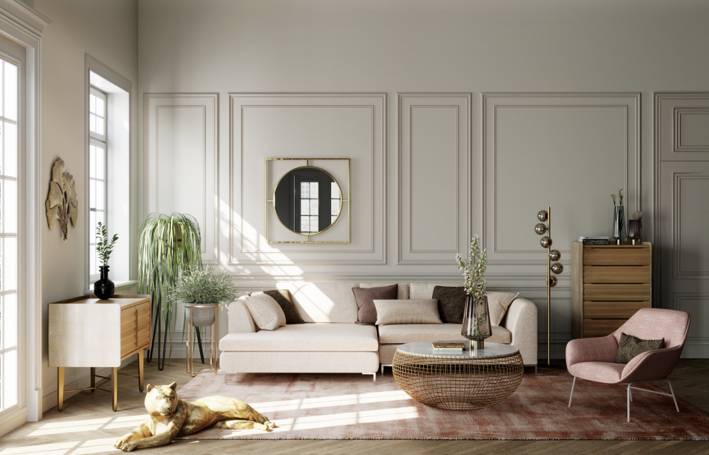
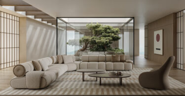
Accented achromatic
Leanne Van Niekerk, owner of LVN Interiors, employs bold design in a subtle way. “The accented achromatic harmony group allows you to incorporate high chroma and vibrant colours that will not overwhelm a space because it is surrounded by neutrals. The green in the wallpaper in this lounge illustrates this.”
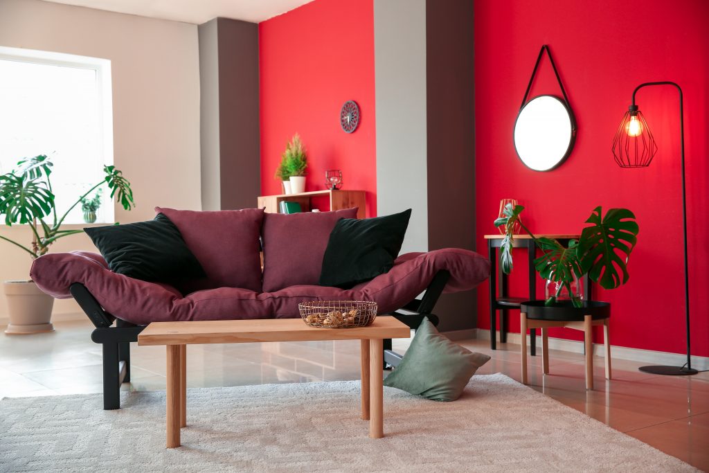
Radiant red
Shannon Prestia, marketing manager at Versus Paint, loves the warmth and richness of a deep red feature wall in the lounge, especially as we head into winter. “This vibrant and energetic colour can be balanced by stark white for some dramatic contrast or dark greys to make a statement. We love it so much we have made it the Versus Paint Colour of the Month for May.”
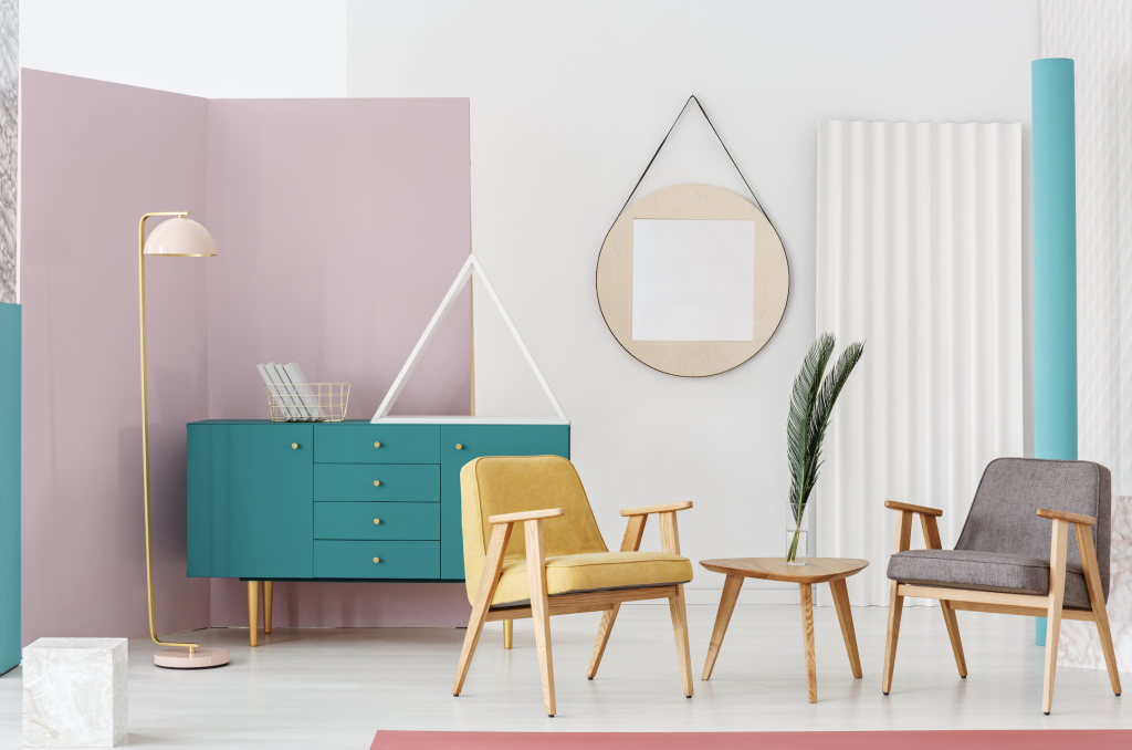
Perfectly pastel
Lani Carstens, Rust-Oleum South Africa marketing manager, says that pastel colours and pinks are often thought of as a feminine colour scheme and brushed over as a possible lounge palette. “Surprisingly, despite their softer shades, chic pastel rooms can be packed with personality and sophisticated energy.
“A mix of cool pinks and blues pairs perfectly with white and grey, but if you want to add an eclectic energy that’s more invigorating, introduce pops of bright turquoise. If you aren’t afraid of colour and want to lighten the mood and introduce new contrast, accessorise with yellow. It’s fun, informal and an edgy addition to the palette.
“Instead of a flat colour and for additional character, create a geometric wall mural – a style of wall art that is best suited to pastel shades. Softer shades can also make a small room look bigger so if you are trying to create a feeling of space this pastel palette could be the answer. The Rust-Oleum Chalked Paint Brush on range of pastels, including Serenity Blue, Linen White, Blush Pink, Aged Grey and Country Grey can be used to replicate this look. The Painter’s Touch Plus Island Blue spray paint can be used on furniture and accessories for extra verve.”
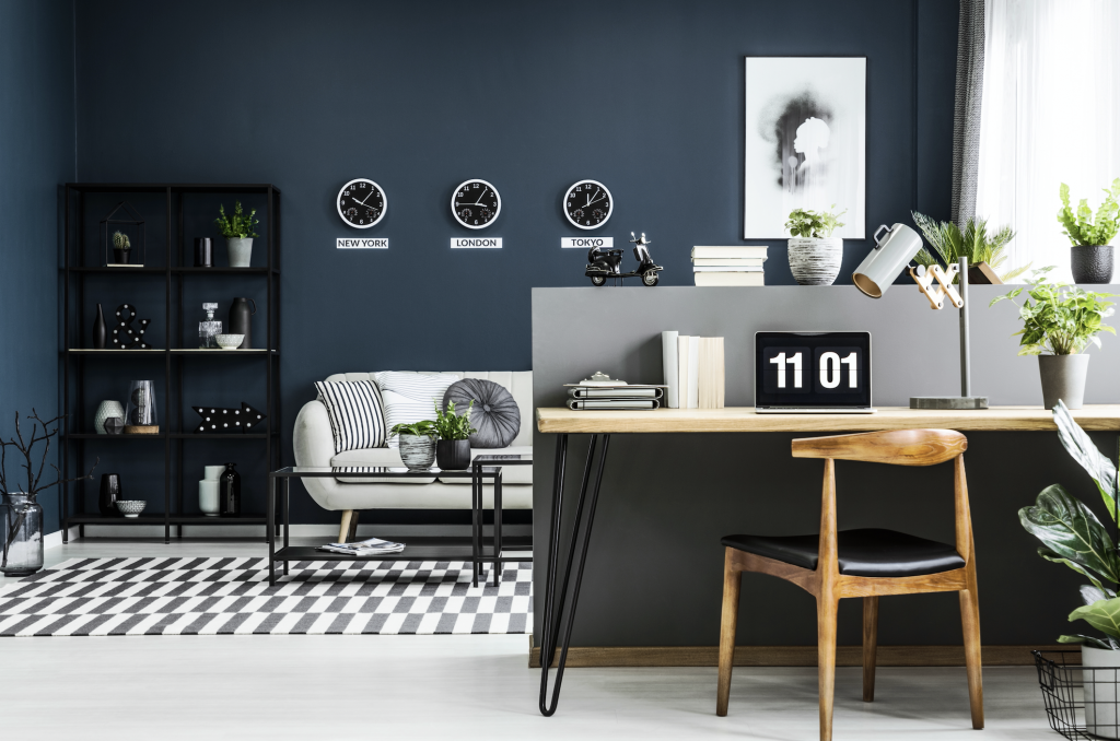
Moody blues with black and grey
Carstens adds that if you prefer more sultry, dramatic colours, then consider anchoring your lounge with a moody blue wall and pairing it with grey and white to keep it light. “The rich hues teether on the edge of black without being too heavy, while lighter greys used on accent walls, will enhance the modern vibe of this palette. The colours all work well together because they have similar undertones.
“Black embellishments, décor and accent furniture will add yet more luxe to this look, while light coloured couches will keep the vibe from getting too heavy. The texture of natural wood will add another dimension to this look. Introduce plenty of plant life to keep the room feeling fresh and relaxed and to break up the darker colour scheme. Rust-Oleum Milk Paint Matte Finish is an excellent brush on paint range with colours that are anything but gloomy and the rich shades will help recreate this contemporary living room look.”

Leave a Comment