
Cool, calm and classic, blue is one of the most versatile decorating hues to use in the home. Six interior experts share different ways to use blue.
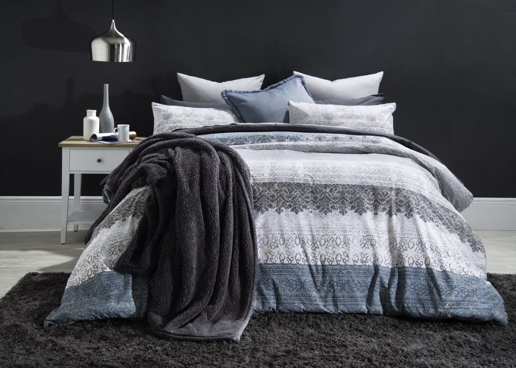
Where: In the bedroom
X-factor: Moody hues
“Deep, rich blue tones and dark teals create a sense of drama in your bedroom,” says Stacey Nel, marketing manager for Volpes.
Boudoirs dressed in a timeless combo of blue and white create a cool, calm and collected silhouette. Nel suggests painting a focal wall in a striking midnight shade and pairing it with crisp navy and white linen.
Volpes
This season, abstract and edgy patterns are on-trend. “Add a sense of contemporary calm to your bedroom by combining all-white walls and dramatic designs,” suggests Nel.
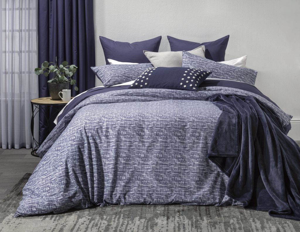
Volpes
For a sense of refined elegance, Anien Biel of Green Scene Interior Projects suggests fusing teals, midnight blue and metallic wallpaper.
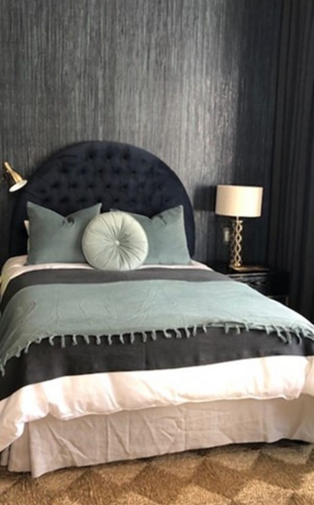
Green Scene Interior Projects
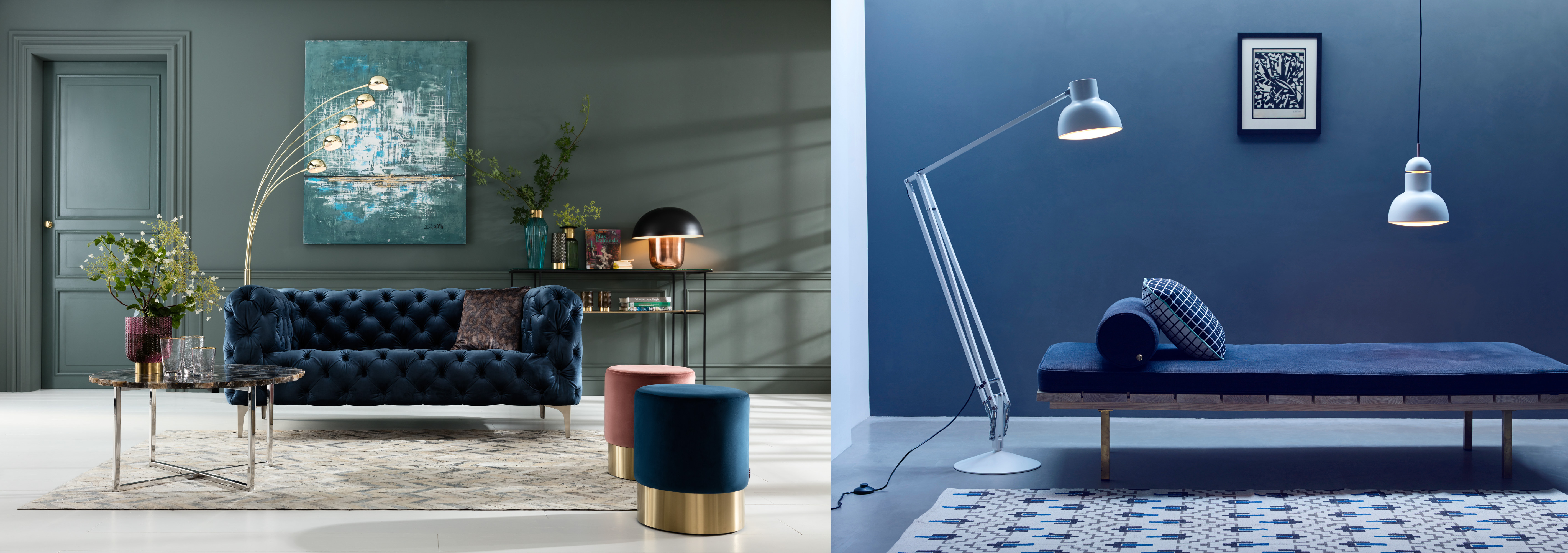
Where: In the living room
X-factor: Cool and collected
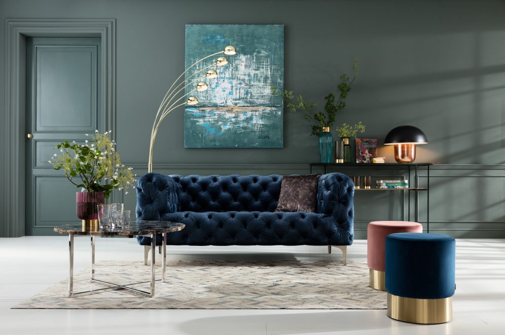
“Blue hues are my favourite colour palette to work with,” says Biel. Whether it’s tiles, fabric or paint, this versatile colour can be used for a range of applications. According to Biel, “Painting a wall in a striking blue hue adds depth and dimension to any room. As is covering a wall in a statement wallpaper.”
Green Scene Interior Projects
“My favourite shades of blue are the richer, jewel tones such as indigo and cobalt. These darker tones add a sense of gravitas and can be used anywhere, from kitchens and powder rooms to bedrooms and sitting rooms,” says Karin Cawthorne of KARE.
KARE
“Blue is by far the most popular choice for interior rugs. While duck-egg blue remains popular, there is also growing interest in other tones on the blue spectrum like turquoise and navy blue,” says Charles Gonsenhauser of Gonsenhausers Fine Rugs. He suggests opting for darker shades to create a richer and cosier interior and lighter shades to create a sense of space.
Gonsenhausers Fine Rugs. Image by Dook Clunies-Ross
Where: On the patio
X-factor: A calm respite
From Club Med to Hamptons-style coastal vibes, blue in all its guises epitomises outdoor relaxation. Reminiscent of tranquil sky and sea, ocean hues create a beautiful equilibrium between invigorating tones and serene quietness.
“Cool blue is the perfect counterpart for any space where you want to relax and escape the heat. It just naturally evokes the feeling of being on holiday,” says Andrew McKay of Andrew Hector Interiors.
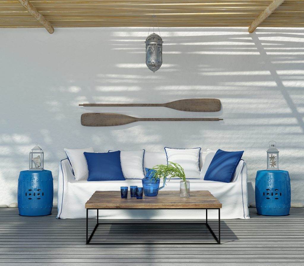
AdobeStock
Where: The dining room
X-factor: Classically cool
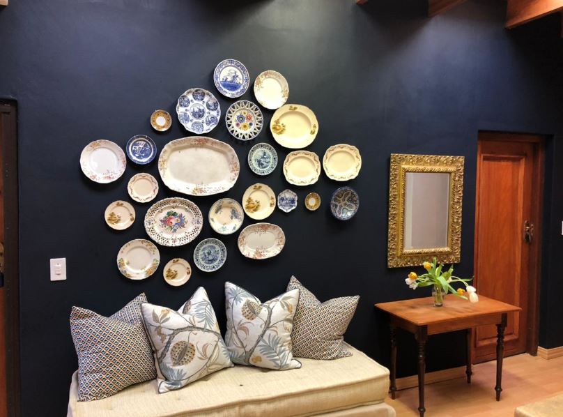
“I’m a firm believer in the saying ‘good never goes bad’. Your interiors won’t date if you stick to classic colours and design principles. The same applies to tableware, as reflected in our flagship range of crockery in blue with a contrasting white background,” says McKay.
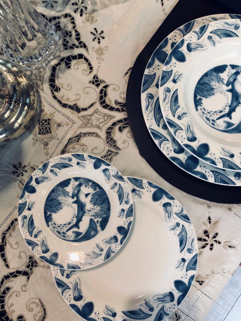
Andrew Hector Interiors
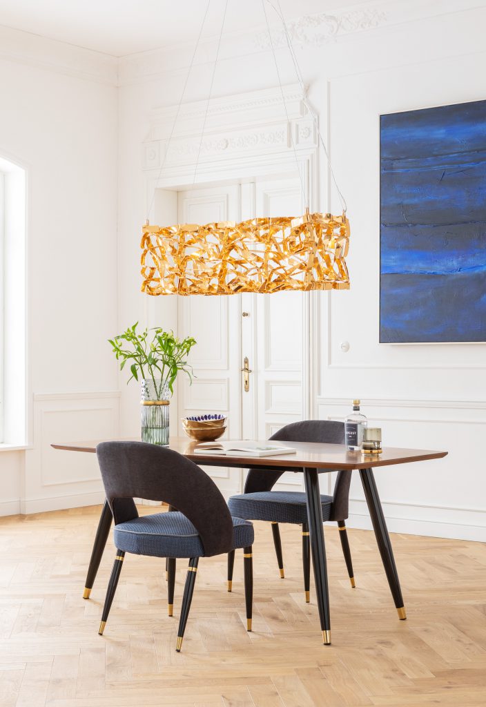
“Warm-toned metallics, like gold and brass, work with darker blues. My top tip for sceptics is to introduce these darker tones using scatter cushions and other smaller décor accessories. Once you’ve built up the courage, introduce larger pieces of furniture in your favourite shade of blue,” suggests Cawthorne.
KARE
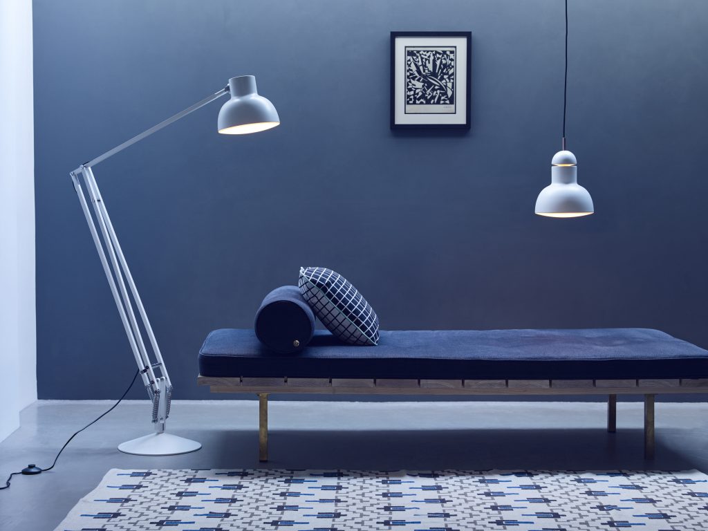
Where: A reading nook
X-factor: Complementary light
According to Guy Harris, lighting designer and owner of Newport Lighting, “A blue colour scheme works best in a room filled with natural light.” In darker spots, he suggests creating warmth by adding touches of gold to your décor ensemble.
“These days, LED lights emit light that is close to natural daylight. Plus, they’re available in a range of warmer or cooler tones – even colour adjustable – making it much easier to implement a blue colour palette more successfully regardless of the room’s orientation to natural light, explains Harris.
Newport Lighting


Leave a Comment