
Tired of playing it safe with colour? We bring you four unusual colour schemes to try in your home.
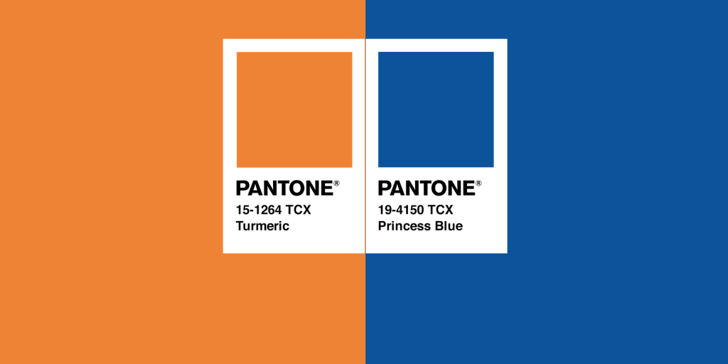
Orange and blue
Interior designer Heather Boting recently saw a beautiful Abé Opperman artwork in his Franschhoek gallery and was immediately struck by the colour combination – orange and blue. “Some might find it to be a very unusual colour scheme, but there is something so vibrant and exciting about it and I would encourage clients use this in their spaces. The reason I’d encouraged clients to use it is because the two colours lie on either side of the colour wheel and this is one of the most successful ways of picking a vibrant colour scheme.”
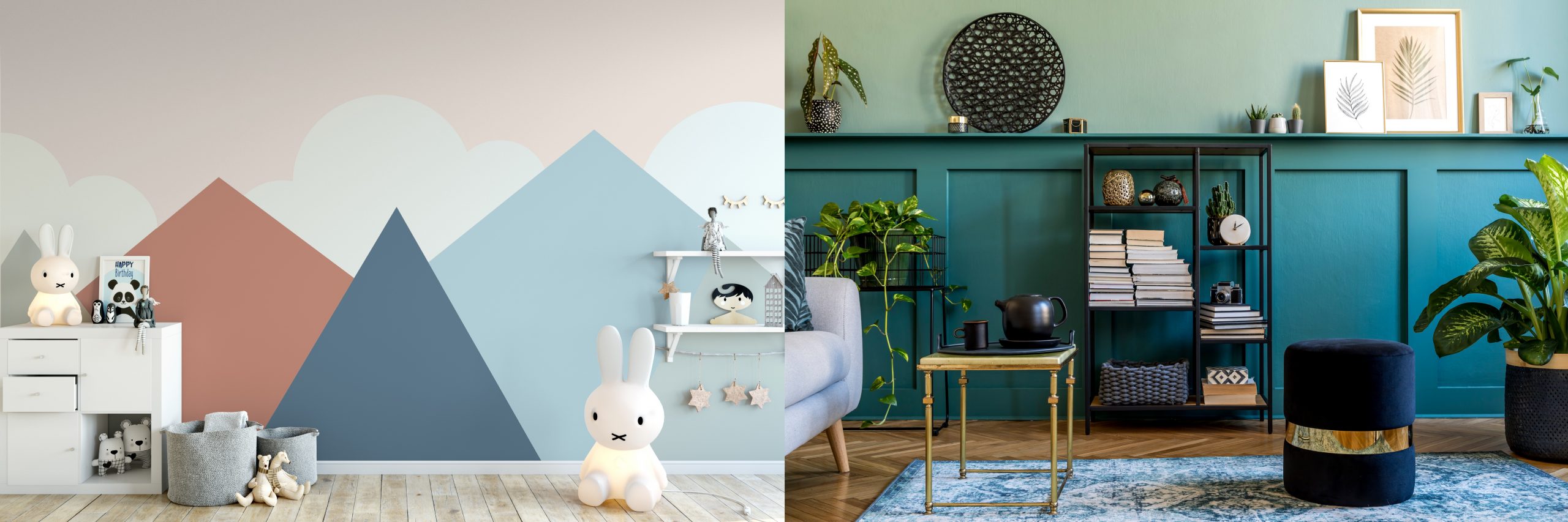
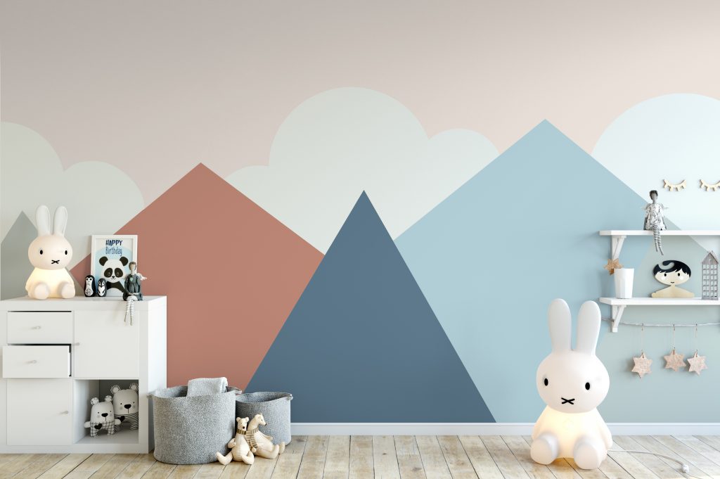
Clay, blue and peach
Colours play a pivotal role in our life and we express ourselves through different shades and our interior décor choices. Herman Rabe, Prominent Paints technical training manager, says that if any room in the house calls for an imaginative spin and bold pops of colour, it’s children’s rooms.
And what better way to create an environment they’ll thrive in than with striking unexpected colour combinations – like those featured in the PPG 2021 Be Well Colour Trends palette.
“A great way to achieve this is to pair knocked-back colours with one strong brighter shade. Who would have thought clay could look so good with blues and peach? The reason this works so well is that these hues are from the murkier end of the spectrum, giving them a slightly subdued feel; this more muted palette flaunts a soft, neutral and soothing feel yet it’s still daring.”
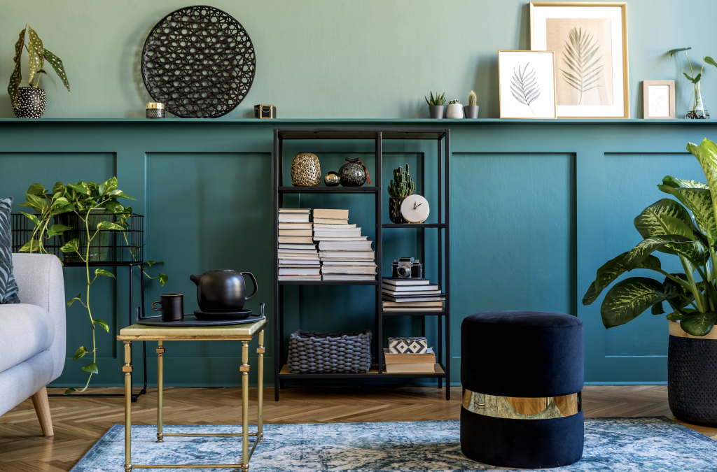
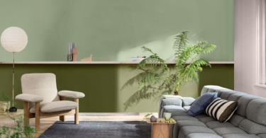
Teal and navy
After the past year, teal, which combines the calming properties of blue with the renewal qualities of green, is a great choice for 2021 – and if it works in nature, it definitely can work in a décor setting. Lani Carstens, Rust-Oleum South Africa marketing manager, says: “Think of the beach or peacock feathers – it’s a real winner. Teal paired with navy, and accessorised with gold, is a divine duo that’s wonderful in a living room or more formal lounge.
“Pick either of the colours as your dominant hue and then introduce accent pieces that tie in and complete the look. For a strong teal, consider Rust-Oleum Chalked Ultra Matte Paint in Tidal Pond; this easy-to-apply spray paint dries to a chalky smooth royal finish you’ll just love.”
Carstens adds, “Research suggests a strong link between natural elements and mental health, and in today’s tech-driven world, introducing plants is an important design consideration – regardless of what divine colour duo you opt for. If you’re thinking of going bold but feel hesitant, then start with a smaller room like your guest loo, or a scullery, to first see how you feel about big colours.”
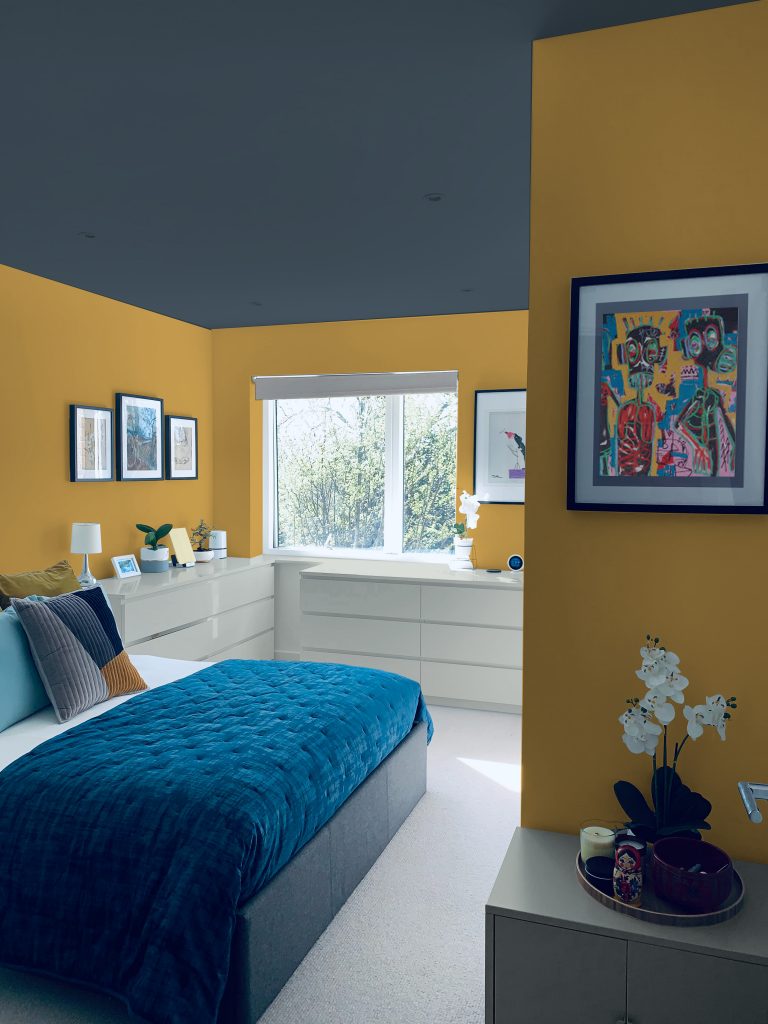
Yellow, white and blue
Some colour combinations can be termed wonderfully weird. When decorating an apartment or home, many people naturally gravitate towards neutral wall colours and flooring or the different shades of grey, adding splashes of colour through accents and pops of furnishings.
Plascon’s head of colour advice Nozipho Kunene instead suggests, “In a land of off-whites and greys, choose personality and paint bold colours.” So go ahead and embrace colour and especially bold and unusual colour combinations that capture attention in new ways.
Plascon’s favourite hue Golden Syrup (Y2-B1-2) is a rich yellow colour that can inject a sense of uplifting warmth and nourishment in interior and exterior spaces. Creating an eclectic look is all about contrast, both with colour and texture, and Golden Syrup (Y2-B1-2) plays off of most colours very well.
For a dramatic effect paint your ceiling in a dark colour like Urban Rock (B4-E1-2), use Golden Syrup (Y2-B1-2) for walls and accent with an off-white such as Lagoon Mirror (EC 3). Painting a room with a dark ceiling makes a space feel cosier and more intimate.


Leave a Comment