
A neutral décor palette provides the opportunity to create interior spaces that are stylish with an excellent foundation for decorating no matter what your style. Five décor experts share their top tips to use neutrals while maintaining personality and style.
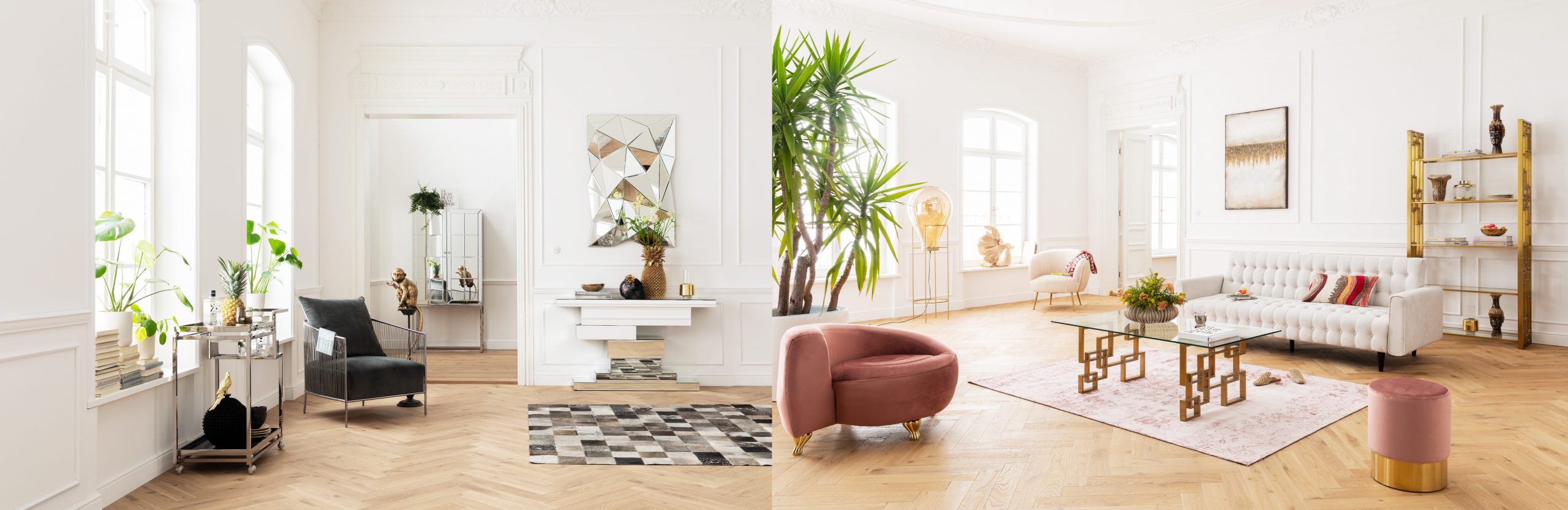
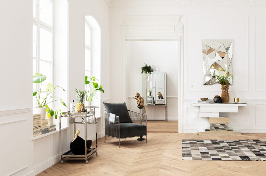
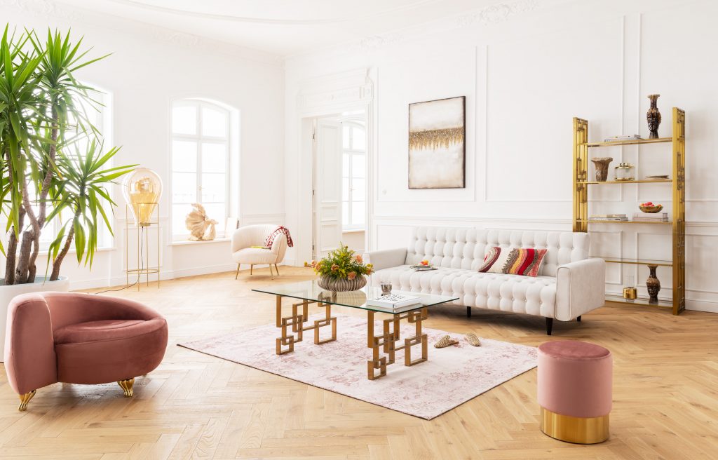
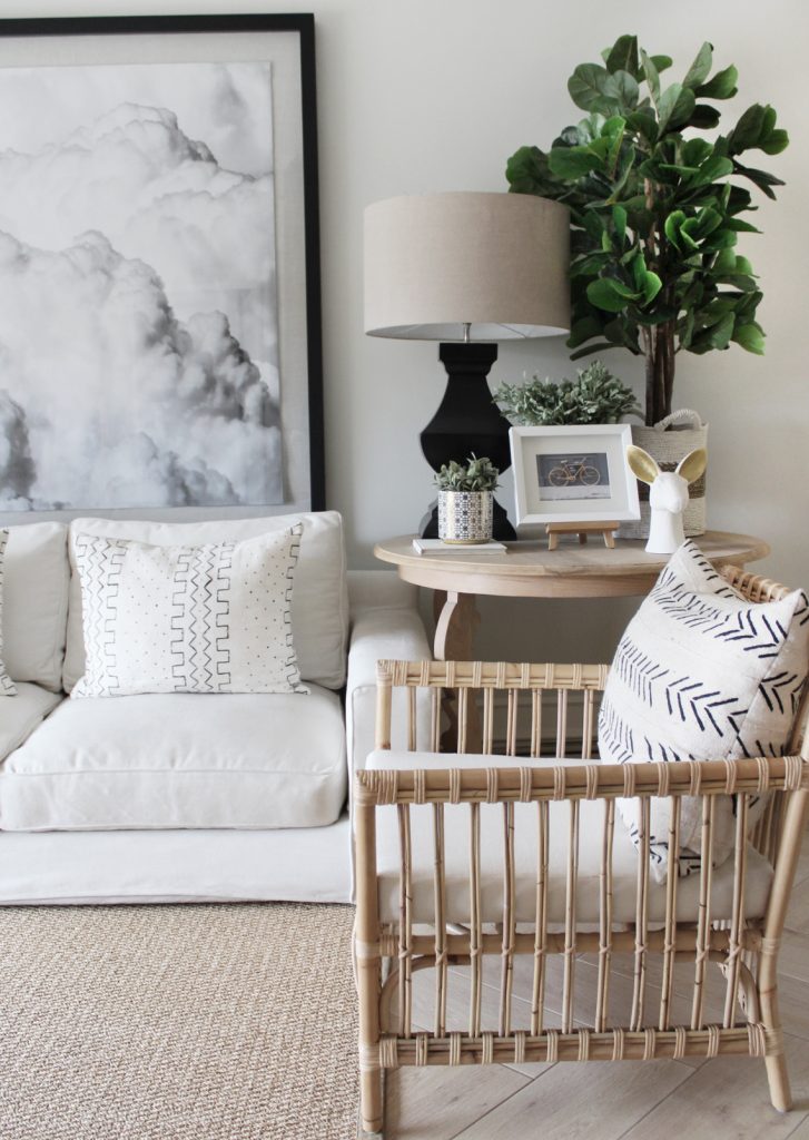
“Décor has moved on from the conventional cream and beige neutral scheme, with a variety of colours in muted tones of pink, terracotta or green, as examples, all jostling to claim the title of the ‘new neutral’. Using these new neutrals in combination creates a sophisticated living area that, while uniformly hued, is, if you look more carefully, also rich in multi-dimensional colour. Should you prefer using just one single colour, be sure to adopt a tone-on-tone approach by using layers of the same colour but in a variety of shades. The darker shades subtly become the accent colours in the space drawing your eye in. In the cream and pink setting, KARE has combined the palest cream with accents of dusky pink. The rug and scatters tie the colour scheme together with their patterns in combinations of both colours. Texture is used successfully with the deep-buttoning of the sofa and the tactile flocked fabric of the cream armchair, whilst the accents of brass add a more vibrant and glamorous style to the setting. With neutral walls and floors the furniture and decorative items within the monochromatic room are given a blank canvas against which they can become the heroes. The monochromatic colour palette adds a level of sophistication that is enhanced by the chrome and mirrored pieces.” – Karin Cawthorne, owner, KARE South Africa
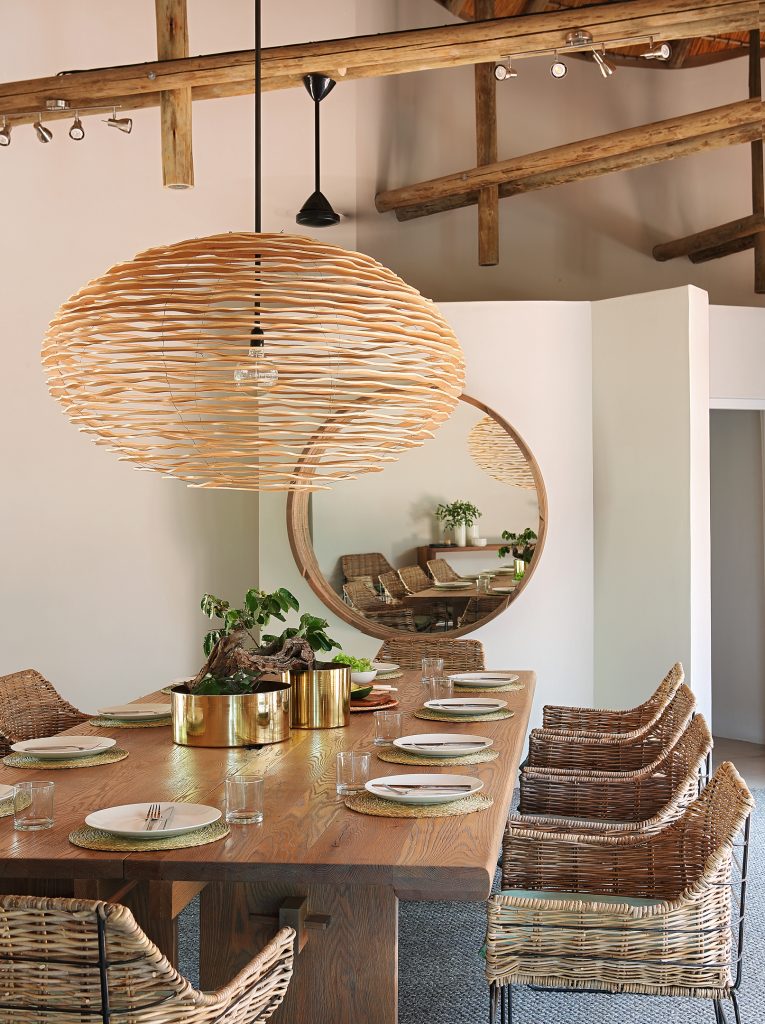
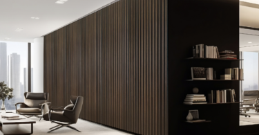
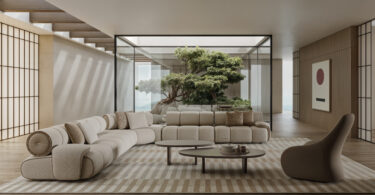
“Each item is a physical material object with a different skin. Choose different materials that complement each other. A coffee table with a rugged timber top could offset a smooth steel frame. A soft linen sofa might have a woollen throw and a couple of velvet cushions. Think about how these materials feel against your hands as you touch them and against each other. I’d rather have two cushions with a really comfortable faux down inners than six with a cheap and lumpy synthetic fill. We worked with a strictly minimalist approach in this lounge, only the bare essentials were included and each of those had to be high quality, intentionally designed pieces. Our colour palette was a soft take on black & white with wood. The clean white walls warm up against teak parquet wooden floors and natural white oak cabinetry. An incredibly dark inky blue works as a neutral that’s not as harsh as black. This dining area is a mix and match of natural materials, which by nature are neutral. The white oak dining table carries a different texture and grain to the mirror frame and the layered birch light fitting above. The basket weave dining chairs set off against woven placemats, a thick jute carpet below and the thatch above. Subtle gold accessories bring visual interest to what’s otherwise a completely grass and wood material selection.” – Lane Reeves, founder, Metaphor Interior Design
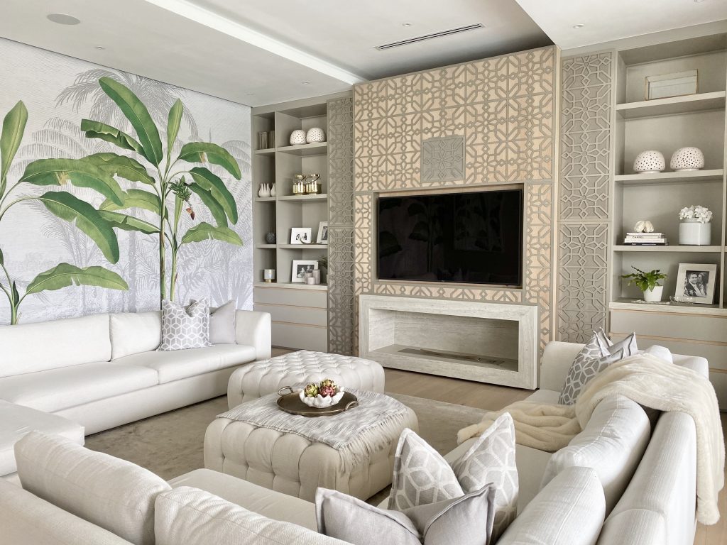
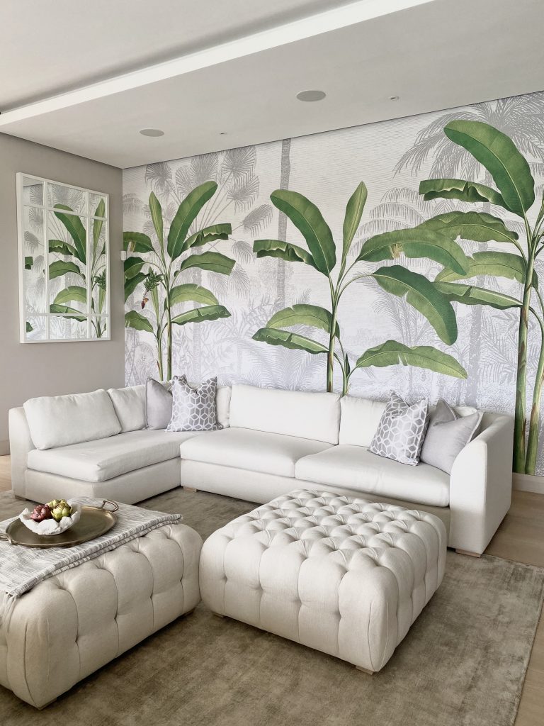
“Neutral rooms can be beautiful and interesting when done right. White, black, brown, beige, cream, grey, and pretty much any muted earthy tones can ‘go’ with anything. These tones provide an excellent background to any other colour, and a solid foundation for decorating no matter what your style. Colours such as white, grey and taupe dominate in this space allowing the wallpaper with its pops of bright green to stand proud. Layers have been created through the use of timber on the floor, stone surrounding the fireplace, the metallic of the laser cut screen and the warm oak behind it. A faux throw, and a combination of plain and patterned fabric on the scatter cushions, creates a textural and tactile effect. The right balance of texture and varied tones is crucial to a good neutral room. ” – Leanne van Niekerk, owner, Leanne Van Niekerk Interiors
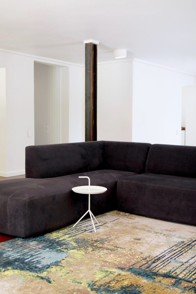
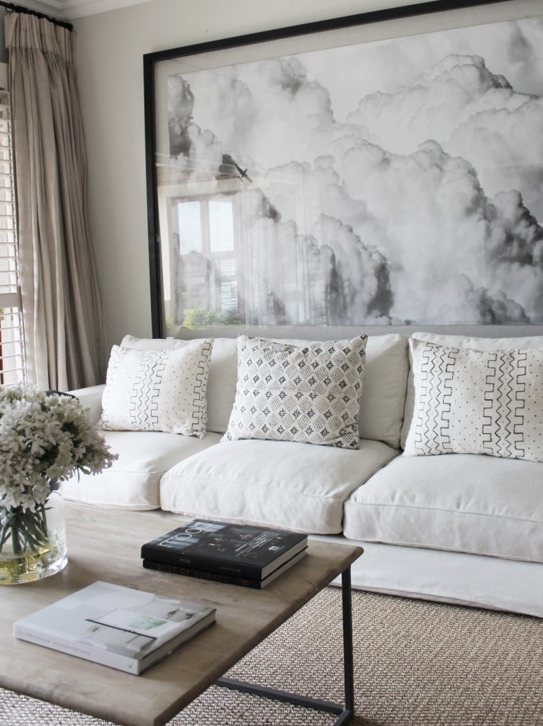
“The base of any living room should be a selection of good-quality timeless pieces. Our team focuses on keeping the basics simple and then creating around these well-selected items. In creating this space our focus on a neutral colour palette created depth in the use of greys and charcoal elements. A heavy focus on texture within our colour range further enhances this depth while keeping within the neutral colour palette creates interest. The dramatic art piece became the focal point for the space. One can select a feature colour to add during seasonal changes to keep the space feeling renewed without breaking the bank. Fresh green scatters in spring or dusty oranges in autumn will ensure your living room feels new and exciting throughout the year.” – Paul Wilson, head of design, The Ground Up Company
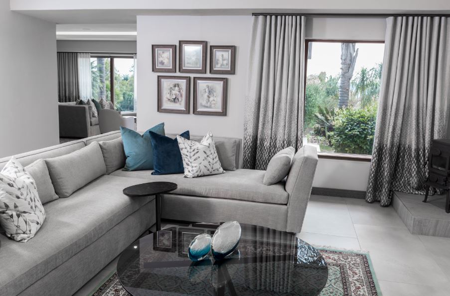
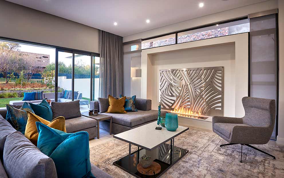
“Neutrals are the glue that keeps a colour kaleidoscope together. Using neutrals [helps to] contrast any other colours, be they pastels or really loud expressions of colour. Neutrals can be a soft grey, charcoal, dove grey, beige and even an off white. They form the base tone but do not carry the theme. In the image with the gallery wall I used a neutral dove grey with two shades of teal as complementary colours. To enhance the neutral colour in the room, the walls are textured in a grey tone, one shade lighter than the couch. The tiles are in perfect harmony with the walls. In the lounge with the fireplace, charcoal is the neutral colour. Different shades of grey were introduced in the room, including a textured grey carpet, with a slightly shiny stainless steel fire screen for detail on the wall. A two-tone coffee table with charcoal frame and concrete stone top and charcoal mirrored base add texture to the family entertainment space and the opulent shades of teal and ochre feature on the velvet-covered corner unit.” – Audi Snÿman, owner Audi Snÿman Interior Design


Leave a Comment