
Neutral interiors are as popular as ever. Here’s how to use muted shades to create elegant and sophisticated interiors.
Whether you like soft pastels or dark, dramatic hues, the right neutral can help you build a signature palette. According to Alon Sachs, co-founder of Mobelli Furniture + Living, “Neutral colours provide an excellent background to any other colour, providing a solid foundation for decorating no matter the style of the space. Other colours can be brought in through decorative accessories and original art.”
The shade: Cool grey
Why it’s cool: Over the past decade, grey has evolved into one of the top decorative neutrals. With industrial- and Scandinavian-inspired interiors still hot on the radar, it seems 50 shades of grey are here to stay.
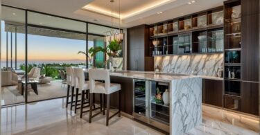
Creating contrast: Neutral dining rooms are a classic choice. However, decorating with these hues can be tricky to get right. “There has to be a good balance between a variety of neutrals in different shades,” explains Sachs. Upholstered dining chairs in shades of grey and brown, juxtaposed with plenty of textural wood elements, will lend an earthiness to the space. The result is comfortable and inviting, rather than dull and emotionless.
Mobelli Furniture + Living
In the mix: “The versatility of different shades of grey offer endless pairing options that work for any space in the home,” says Nadine Prinsloo, head of marketing at Cemcrete.
Cemcrete
Cemcrete
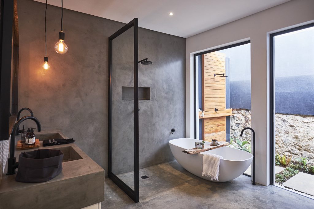
Nature’s neutral: Seamless natural-grey cement finishes are ideal for creating a unique organic look. Why not give your bathroom a style reboot with an on-trend wall-to-floor cement finish?
Cemcrete
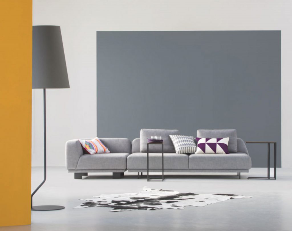
Monotone magic: Introducing shades of the same silver-grey creates a cool, pulled-together look. Add interest with layers of texture, pattern and pops of bold colour.
Plascon
The shade: Warm grey
Why it’s cool: While grey is mostly viewed as a cool neutral, this needn’t be the case. Partnered with bright whites and blonde wood tones, shades with a taupe undertone invite a clean, calm aesthetic into your home.
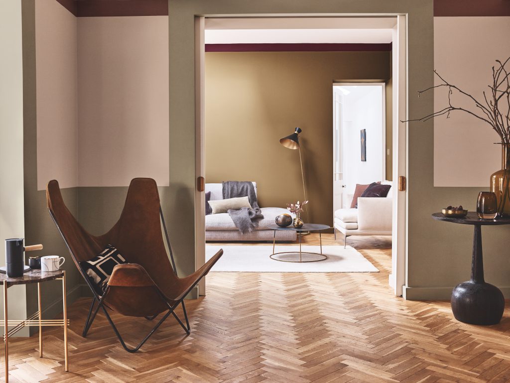
Safe and sound: Craft a warm, natural look by opting for a fusion of grey and beige as a base palette
Plascon
According to Plascon’s colour expert Claire Bond, Ravine (62) – Plascon’s neutral of the year – provides a natural canvas for a painted feature wall, curtaining, flooring or upholstery.
The shade: Rich cream
Luxuriously rich cream has put a new spin on their drab, dated counterpart. According to Nathalie Sweeney, decorative paints marketing director sub-Sahara Africa for AkzoNobel, there’s a growing appreciation of honey-inspired shades across fashion, architecture and design.
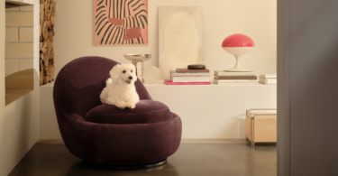
Rebooted luxury: Creme Brulee, Dulux’s Colour of the Year, creates the ideal backdrop for a warm, inviting space. Pops of blush pink and subtle salmon complement this warm neutral. As do saturated shades of aubergine, mustard and marsala.
Dulux

Leave a Comment