

For some an all-white bedroom is a dream, while others need a splash of colour to wake up to every morning. Speaking to the experts, here are contrasting bedroom paint colours interior designers love:
Bright and bold
Henna Daya and Fefe Ntsoelengoe, co-owners of Nerve Dezign, believe the main bedroom is the one place in any home that reflects who you are as a person. They say: “Colours that we love right now are deep shades of blue and green for a bolder, more daring look, and a beautiful summer yellow for a brighter and more playful look.”

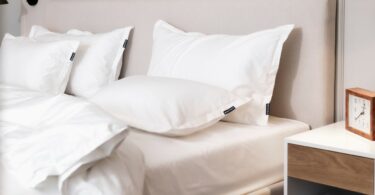
For Daya, yellow is a must to consider. “When it comes to using yellow, most people automatically think a bright acid yellow, and cringe at the thought of using this colour in the bedroom. Yellow comes in many shades, from acid right down to soft mustard shades. It brings a sense of warmth into the bedroom and is proven to have positive effects on people who see the colour first thing in the morning.” She says the trick to achieving a beautiful design using this colour paint is to not overdo it. “Painting bedroom walls doesn’t always mean painting the entire wall or even all four walls. Play around with designs and patterns! The design below shows a bedroom set-up which is pretty toned down and neutral. Once we add the yellow scatters, a throw, and paint a simple circular design on the wall behind it, it transforms the entire space. We then accessorise with neutral colours such as black, white and pops of gold to create a chic new bedroom. The beauty about working with smaller items in any colour like the throw and scatters is that after a while if you want to change it up, all you have to replace is the wall colour and accessories.”

Contrasting, Oceanos by Plascon is loved by Ntsoelengoe. She says: “The Plascon colour Oceanos is a dark mixture of green and blue. This colour is dark but definitely not gloomy. It is vibrant and regal, and is as inviting as bright radiant colours, but also sophisticated and elegant, which in our opinion makes it trend-appropriate for long-term use. It is amazing how a strong hue like this one can complement the walls of multiple contrasting bedroom personalities and be the focal point without dominating the décor elements such as accessories and furniture. This colour can be effectively used by adding bright bold colours against it such as yellows, magentas, and effective warm colors. For someone who is intrigued to paint the room black for instance, but is not confident, this hue is a great option. Paring Oceanos with gold or copper metallics also gives it a regal, expensive and slightly modern take on a Victorian style, making it a Hollywood regency style. For those who are more on the conservative side, the use of this hue works wonders with your nude, beige, blush and sandy hues, and can be paired with light and dark wood detailing, giving it a modern take on a California beach house look.”

In the mood
Interior designer, stylist and consultant Hendre Bloem from Hendre Bloem Design is inspired to create dramatic and moody bedroom spaces, resulting in a sophisticated and stylish space.

Known for a distinctive look, Bloem’s approach involves a play of moody hues, which is achieved through paint colours too. “The use of light and dark has always plays a vital role in my signature style that I have become known for. Contrasting colours, in these cases deep charcoal and an ‘almost there’ white, creates a tonal play that makes a statement in their own right but more importantly, merges all the elements in the room together. Contrast can also be created through texture, by adding a tonal or neutral textured wallpaper against a sleek painted wall.”

Subtley striking
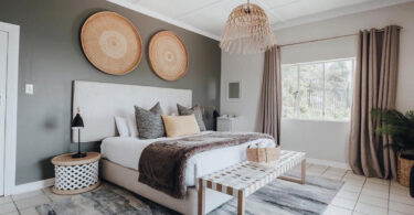
Sarah Watermeyer of Sarah Watermeyer Design loves colour. “In reference to the image below: In small spaces, bright and vivid contrasting colours can be used to expand the space, helping to bring a small room alive. Many people believe that small spaces should be white and bright, but I’ve proved that small spaces are enhanced by brilliant colours.”

In reference to the below image, Watermeyer shows a more subtle use of contrasting colour. She explains: “This main bedroom from the Bahamas is a perfect example of how Sarah Watermeyer Design contrasts the hard and soft finishes in the space. While the wall colour is white, the floors are made to be colourful with stunning aqua-coloured tiles from Southern Art Ceramics, a South African company. The gentle wall colour is contrasted with the bold flooring that brings the ocean into the room, which is also contrasted with the room’s bright décor.”

Playfully placed
Lisa Swart, interior designer and owner of Oksijen, believes you should never judge a colour by its swatch. Referring to the image below, Swart says: “For this bedroom, we chose the Plascon colour You’re My Sweetie, which is usually peachy but once it was painted on the wall, it turned into the most perfect dirty pink. The colour inspiration came from the Mexican floor tiles chosen for the bathroom.”

Swart says neutrals don’t need to be boring. “In the bedroom in the image below, cosy raffia wallpaper gives the room a calm and embracing feel, which is further enhanced and complemented by calming blues and greys to create an oasis of calm. The natural raffia wallpaper blends seamlessly with Plascon’s Mandarin tusk grey walls.”


Leave a Comment